pentagramdesign
Why it is here
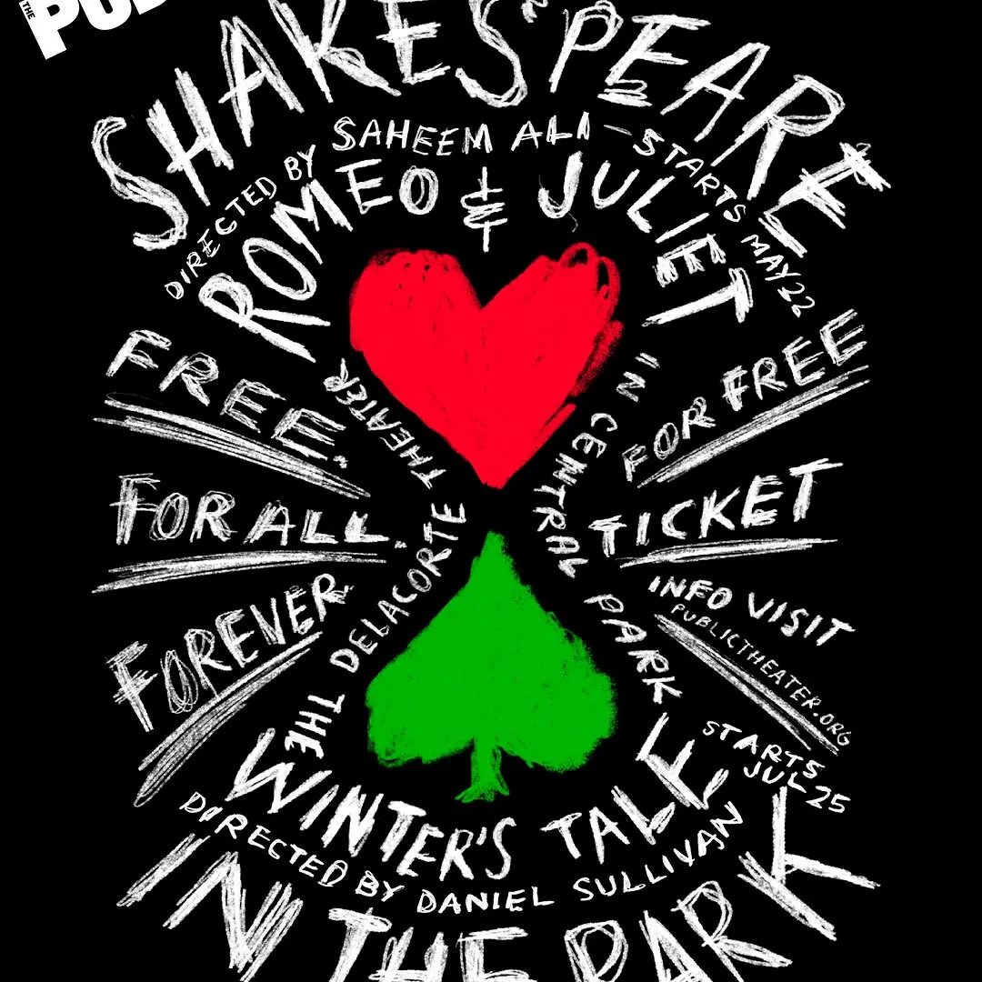
Expressive hand-drawn lettering radiates dynamically around central card motifs to create strong typographic energy.
The grade
- Typography
- 7
- Composition
- 7
- Colour
- 6
- Craft
- 7
- Originality
- 7
76/100
Style
Details
Since 1994, Paula Scher has designed the promotional campaigns for Shakespeare in the Park, the free summer performances presented by @publictheaterny at the Delacorte Theater in Central Park. Each year, the Shakespeare graphics update the spirit and use of Knockout, the font of…
Posted by pentagramdesign on instagram. All rights belong to the author — we link to the original and host only a preview.
Are you the author and want your post removed? Write to hello@anomalia.so and it is gone the same day.
Design posts
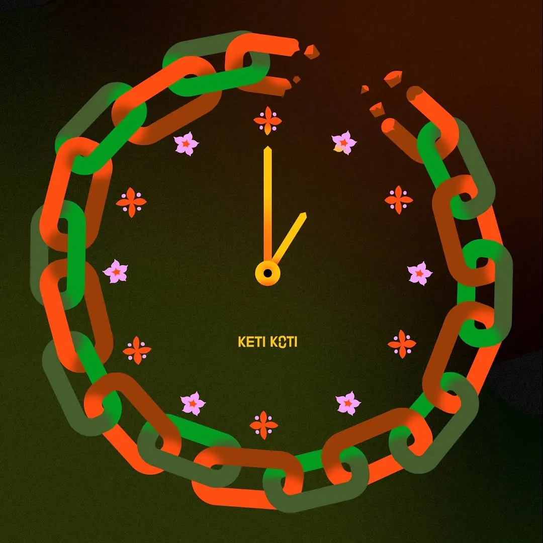 The broken chain cleverly doubles as a clock face framed with delicate floral hour markers.
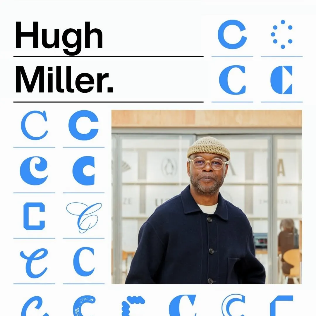 A disciplined modular grid organizes diverse typographic glyph variations alongside bold headline type and portraiture.
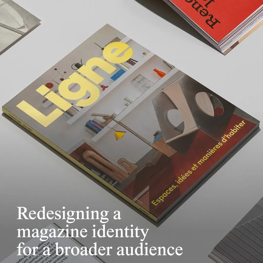 Bold yellow masthead typography sits firmly against a balanced architectural interior photograph.
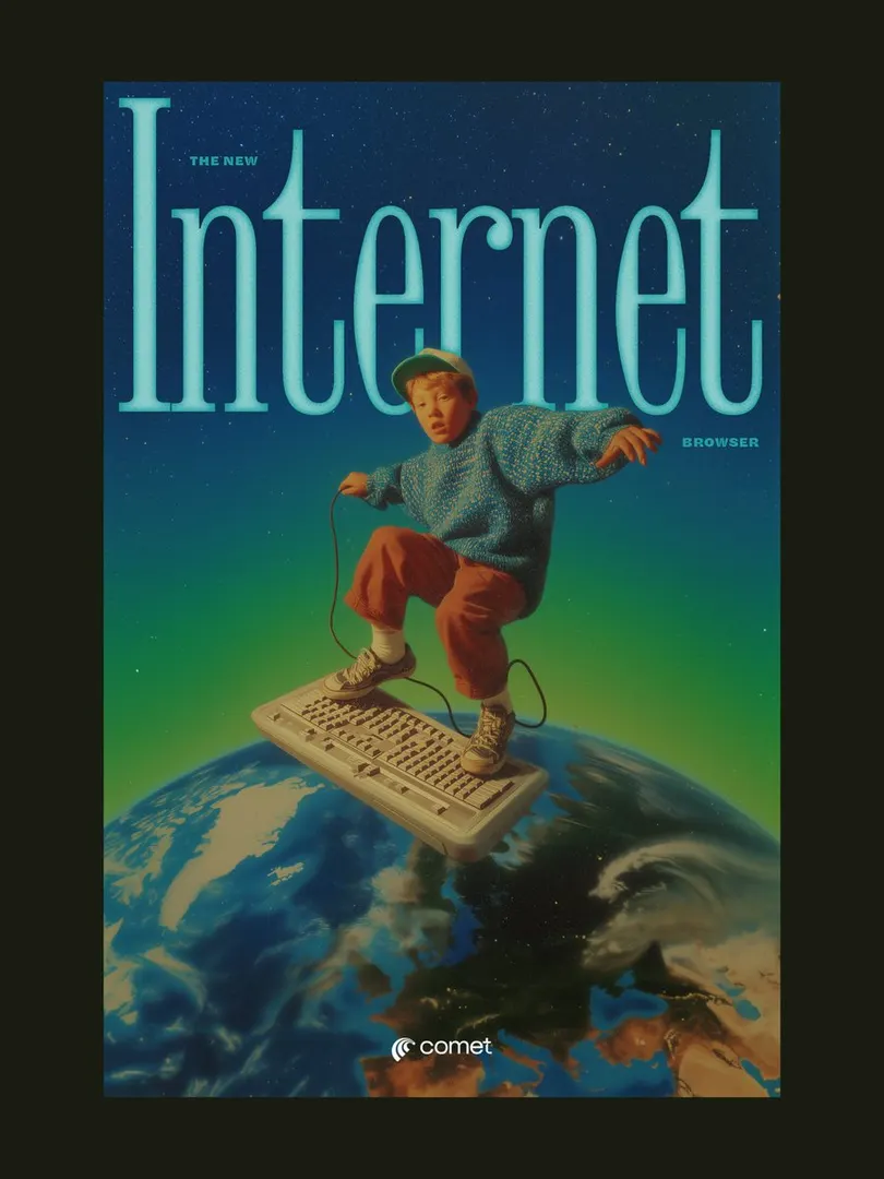 The condensed serif headline neatly frames the subject, creating layered depth in a retro surreal composition.
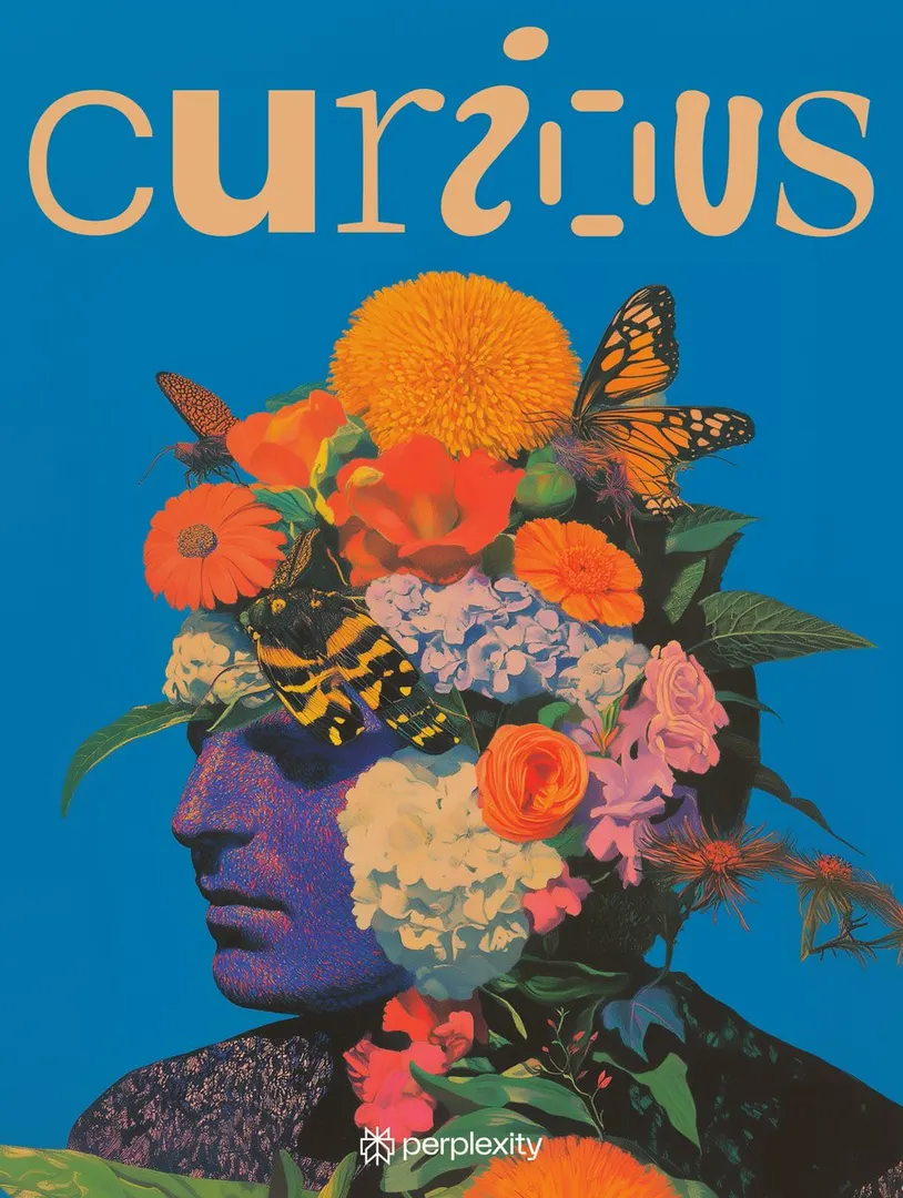 Playful custom letterforms balance the dense botanical portrait against a vivid solid background.
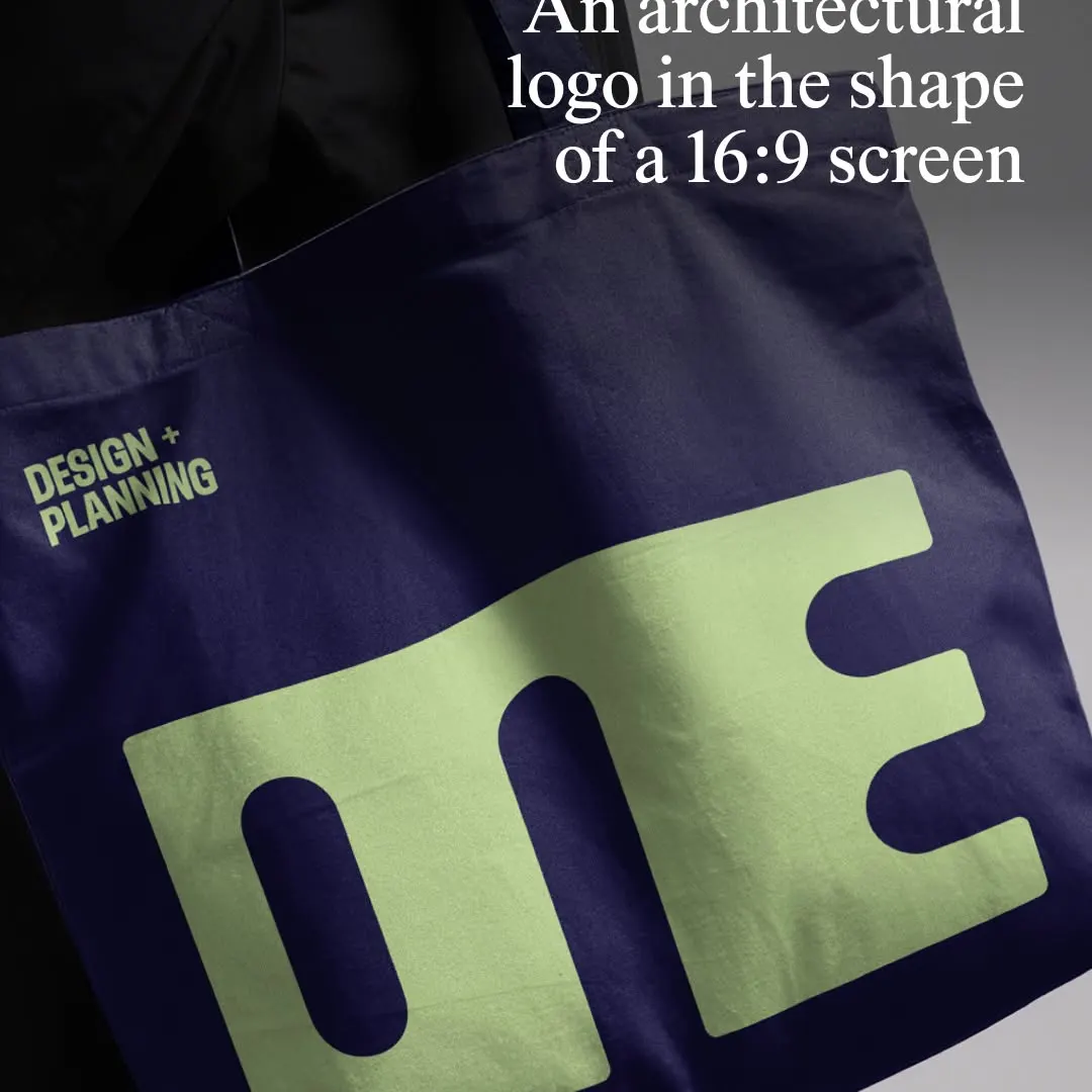 The monolithic wordmark compresses letterforms into a strict 16:9 proportion on a tactile tote bag mockup.