thebrandidentity
Why it is here
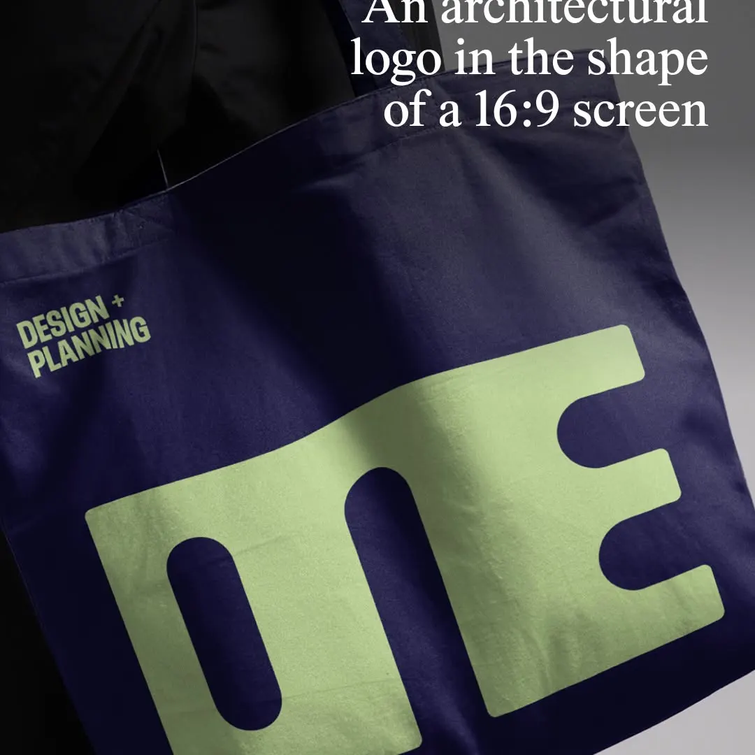
The monolithic wordmark compresses letterforms into a strict 16:9 proportion on a tactile tote bag mockup.
The grade
- Typography
- 7
- Composition
- 7
- Colour
- 7
- Craft
- 7
- Originality
- 6
70/100
Style
Details
@5x5.design has evolved the identity for @one_arch_urb, an architecture and urbanism practice that designs resilient cities for the long term. The London-based agency built the new mark directly from the letterforms of Typotheque’s Zed Display, merging them into a…
Posted by thebrandidentity on instagram. All rights belong to the author — we link to the original and host only a preview.
Are you the author and want your post removed? Write to hello@anomalia.so and it is gone the same day.
Design posts
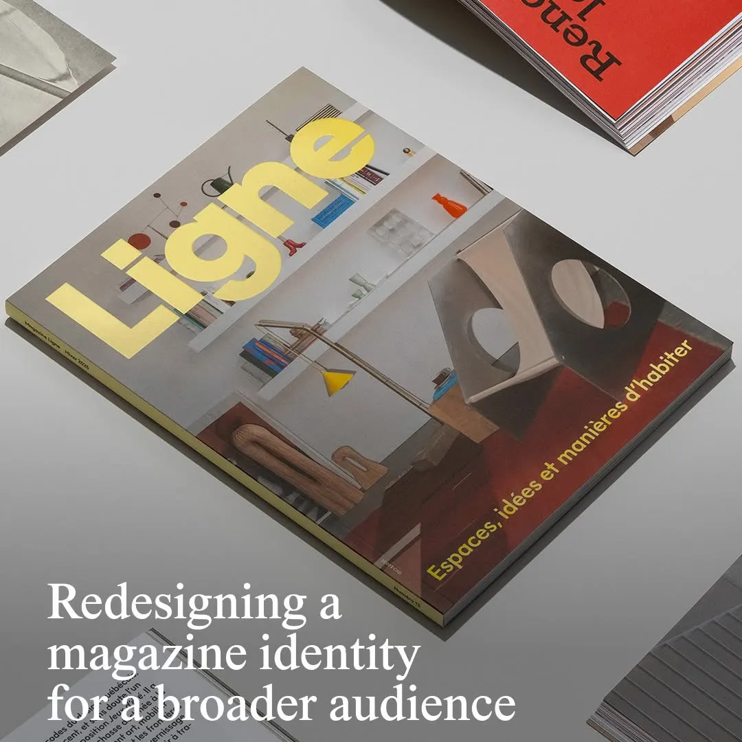 Bold yellow masthead typography sits firmly against a balanced architectural interior photograph.
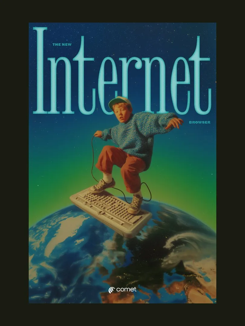 The condensed serif headline neatly frames the subject, creating layered depth in a retro surreal composition.
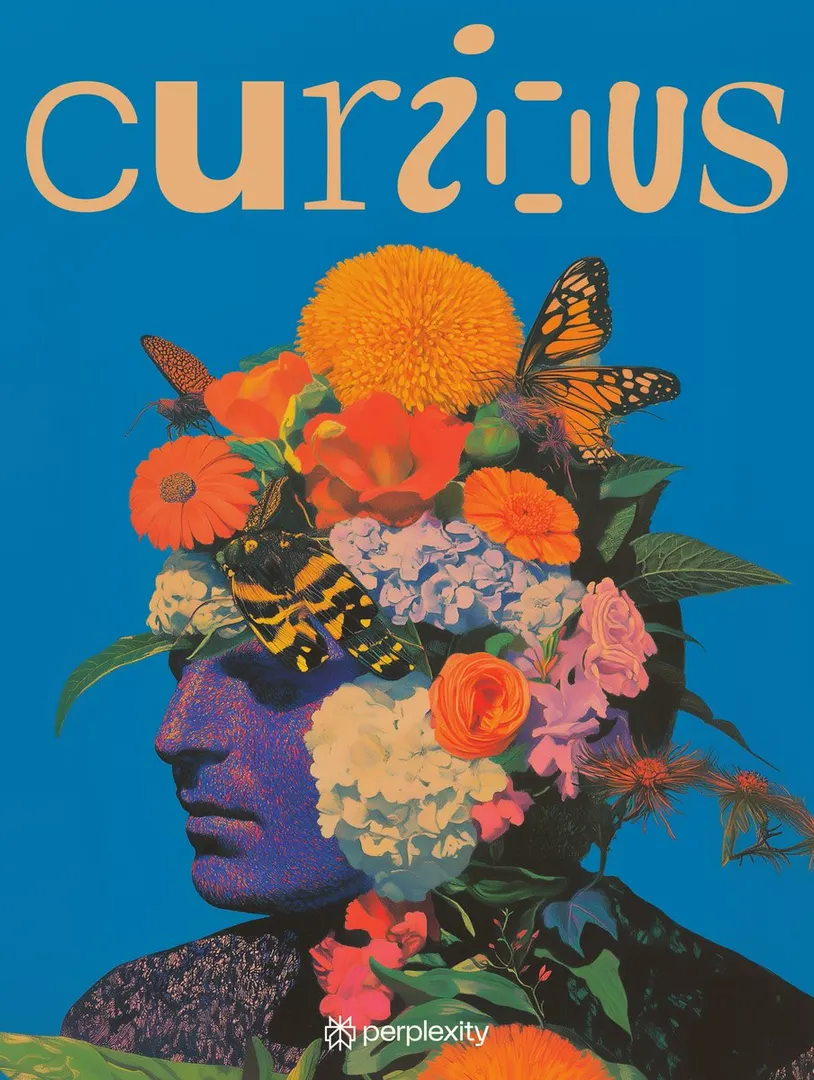 Playful custom letterforms balance the dense botanical portrait against a vivid solid background.
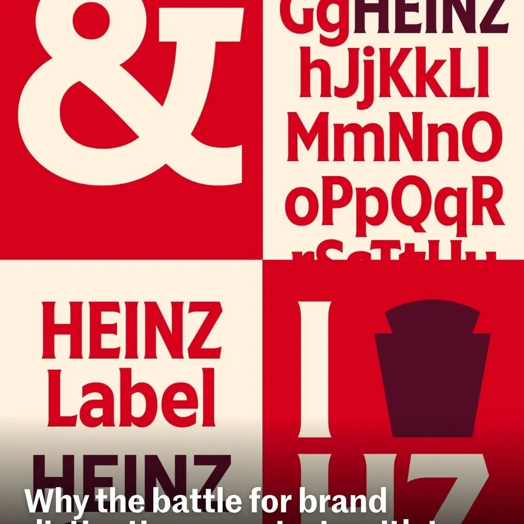 Bold alternating quadrants create rhythmic contrast to showcase custom brand typography and glyphs.
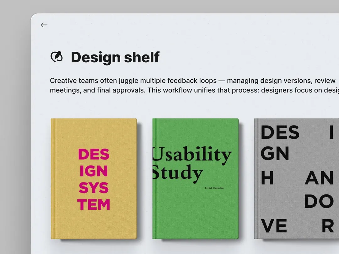 Realistic textured book covers ground the minimal interface typography with tangible color and weight.
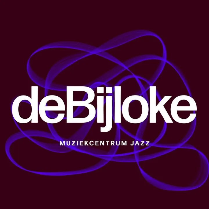 Fluid oscilloscope loops weave behind crisp white typography to visually reflect musical improvisation.