pentagramdesign
Pourquoi il est là
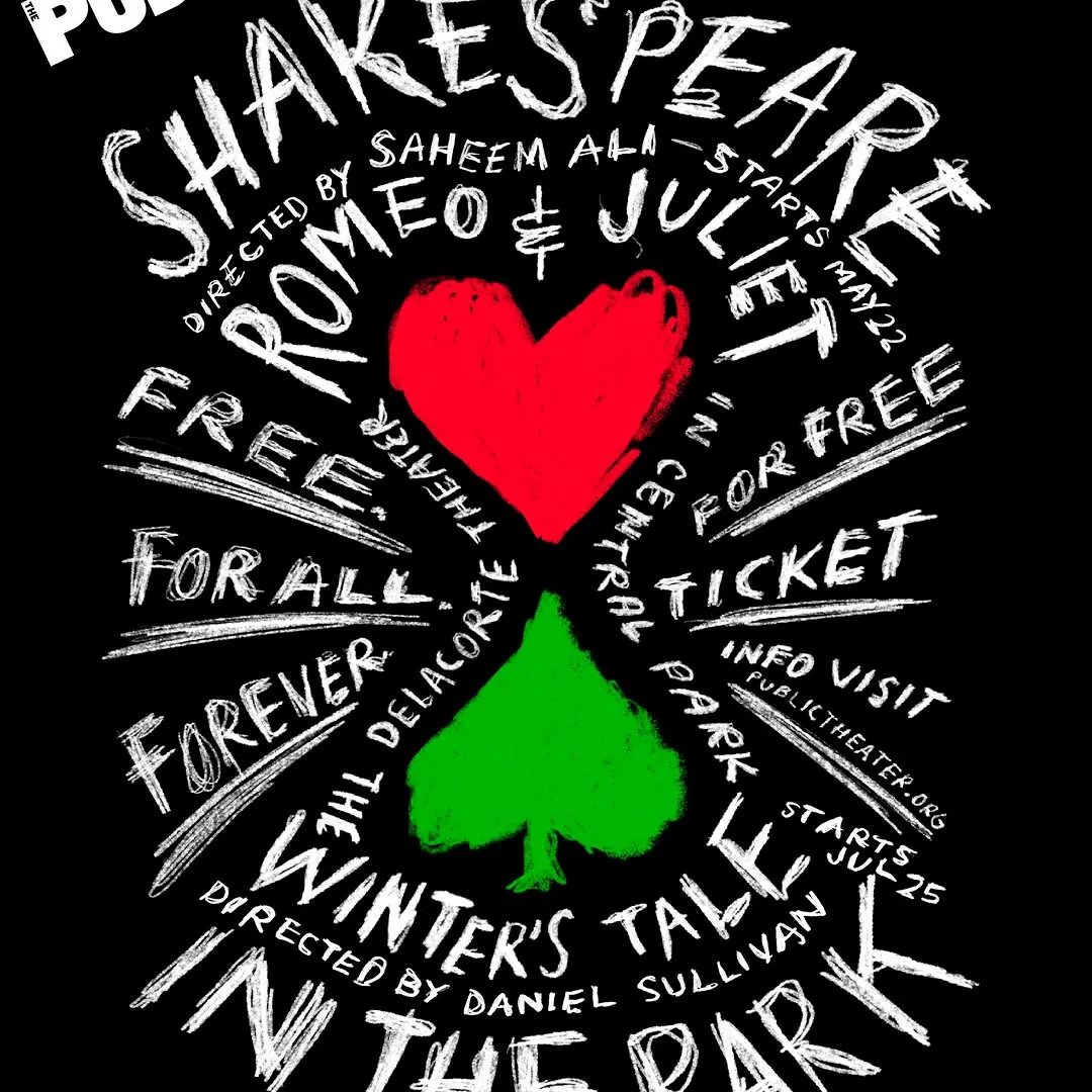
Le lettrage manuscrit rayonne dynamiquement autour des figures centrales, créant une forte énergie visuelle.
La note
- Typographie
- 7
- Composition
- 7
- Couleur
- 6
- Exécution
- 7
- Originalité
- 7
76/100
Style
Détails
Since 1994, Paula Scher has designed the promotional campaigns for Shakespeare in the Park, the free summer performances presented by @publictheaterny at the Delacorte Theater in Central Park. Each year, the Shakespeare graphics update the spirit and use of Knockout, the font of…
Publié par pentagramdesign sur instagram. Les droits appartiennent à l’auteur — nous renvoyons vers l’original et n’hébergeons qu’un aperçu.
Vous êtes l’auteur et souhaitez le retrait de votre post ? Écrivez à hello@anomalia.so et il part le jour même.
Des posts bien faits
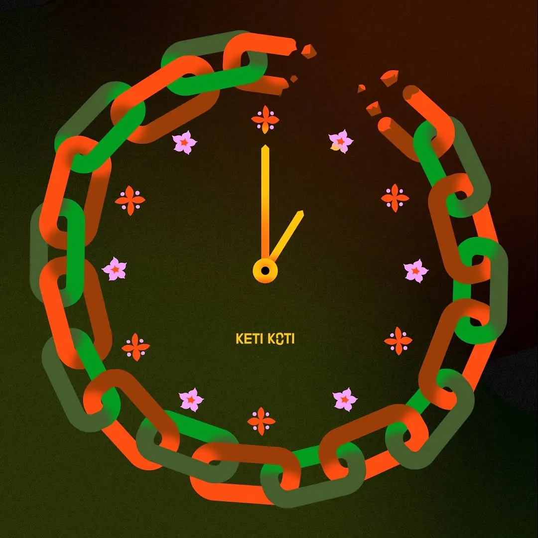 La chaîne brisée sert ingénieusement de cadran d'horloge encadré par de délicats index floraux.
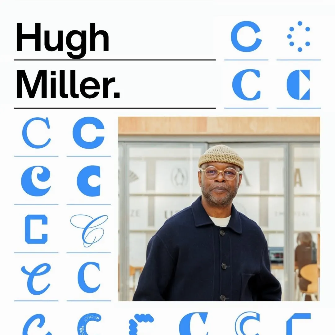 Une grille modulaire rigoureuse organise des variations typographiques aux côtés de titres forts et du portrait.
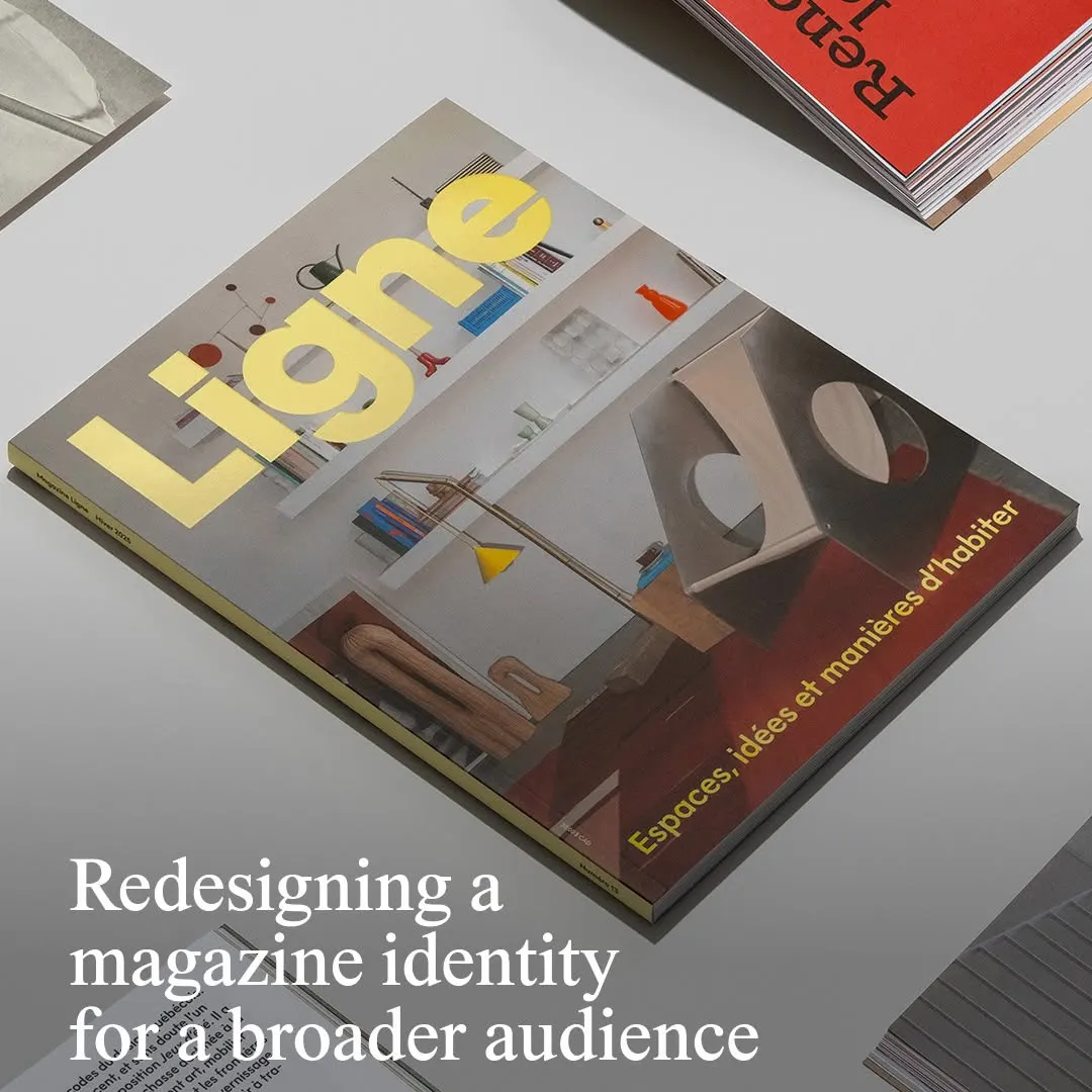 La typographie jaune vif du titre s'impose nettement sur une photographie d'intérieur architectural équilibrée.
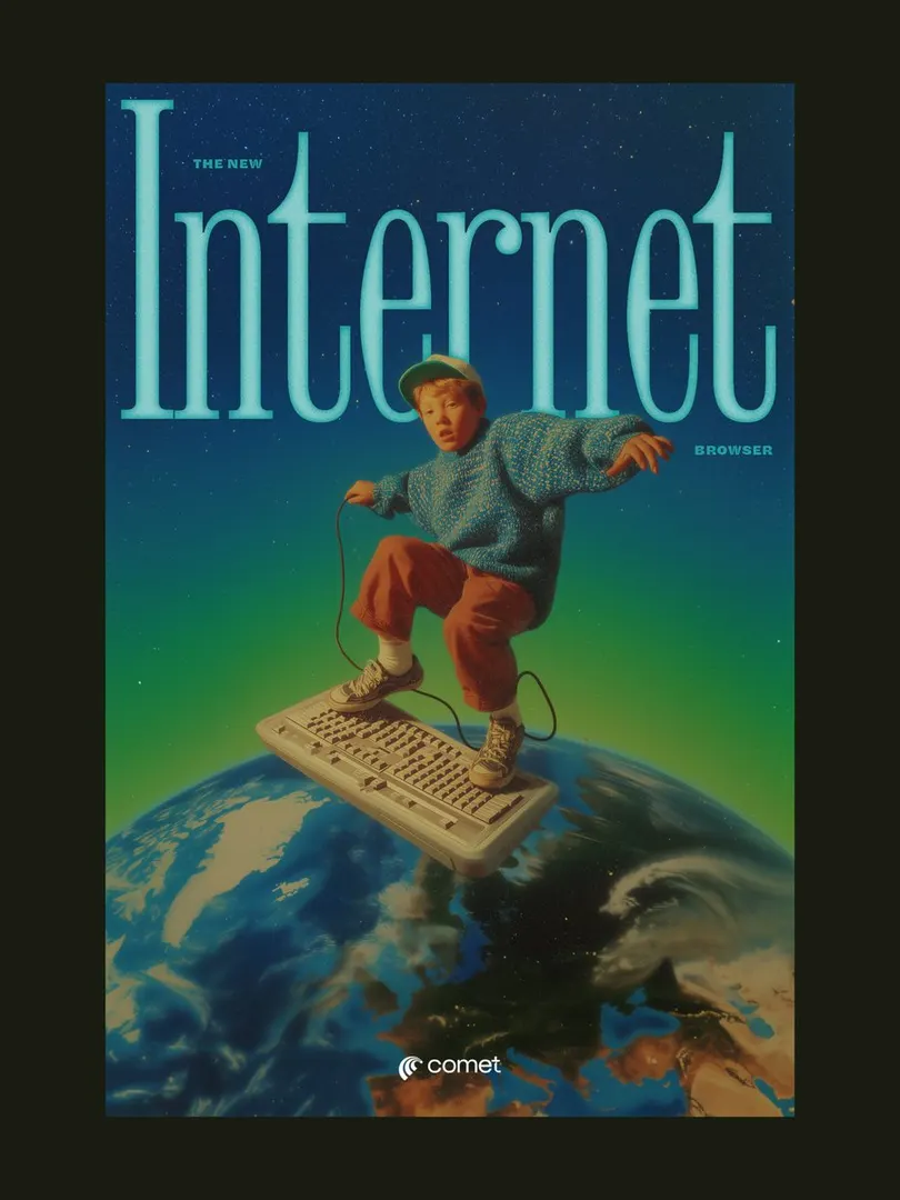 Le titre à empattements condensé encadre le sujet, créant de la profondeur dans une composition surréaliste rétro.
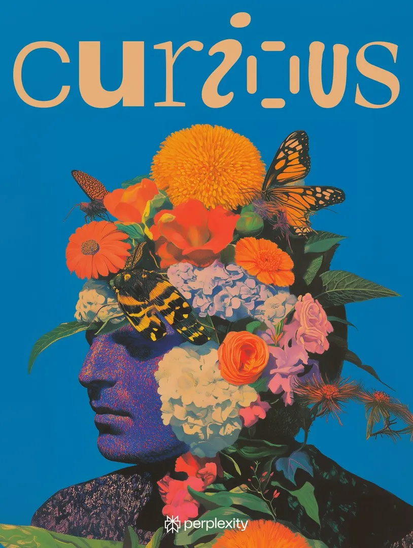 Un lettrage sur mesure équilibre ce portrait botanique dense sur un fond monochrome éclatant.
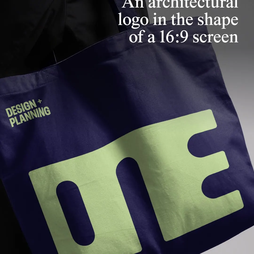 Le logotype monolithique compresse les glyphes au format 16:9 sur un mockup de tote bag textile.