Editoriale
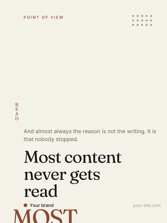
A magazine. The headline is anchored low, everything above it is air, and nothing else happens.
Open style →Each style is a complete system: eight 3:4 slides and three 9:16 story layouts. The words here are placeholder on purpose — what you pick is the form.
A magazine. The headline is anchored low, everything above it is air, and nothing else happens.
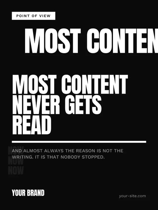
Open style →A poster. The headline takes half the canvas in condensed caps and ambushes the scroll.
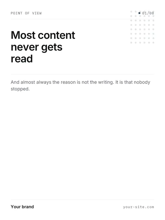
Open style →A spec sheet. Everything rests on a grid of hairlines and the type scale stays low.
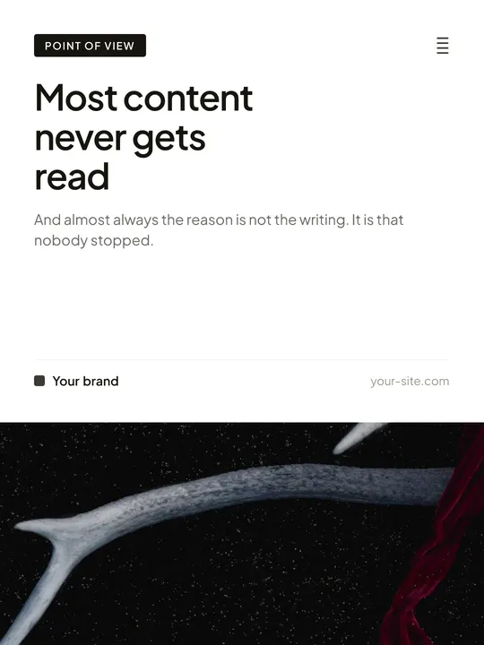
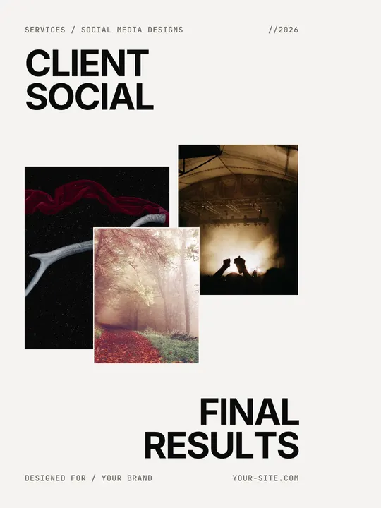
Open style →A catalogue. Every single slide carries a photograph and the type stays a caption, never the lead.
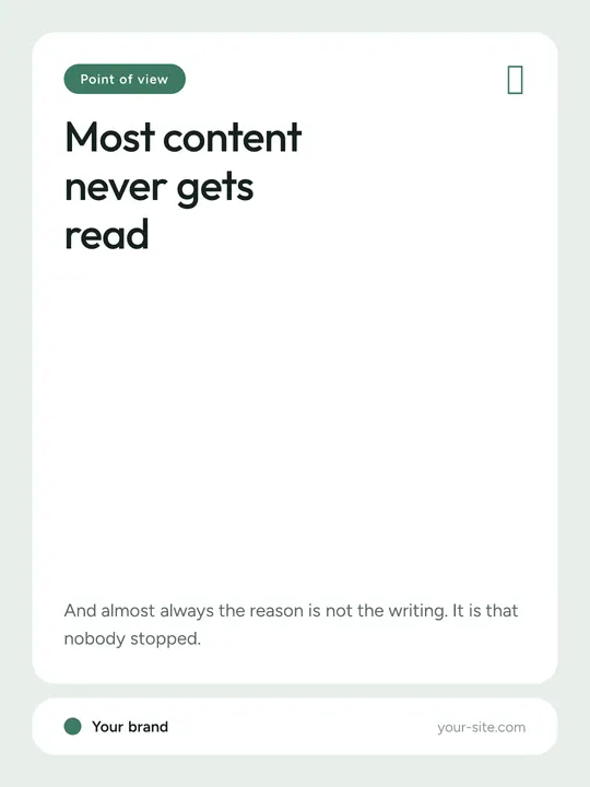
Open style →Everything lives inside rounded white cards floating on a coloured field. Nothing ever touches the edge.
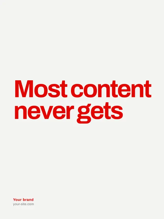
Open style →Cream, bright red, huge type with lots of air. Almost nothing else.
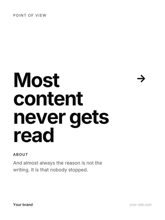
Open style →A project sheet on pure white. Clean left axis, huge title with arrow, air on the right.
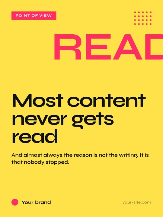
Open style →A shout on a primary colour. Heavy type, a coloured stamp, no dead air.
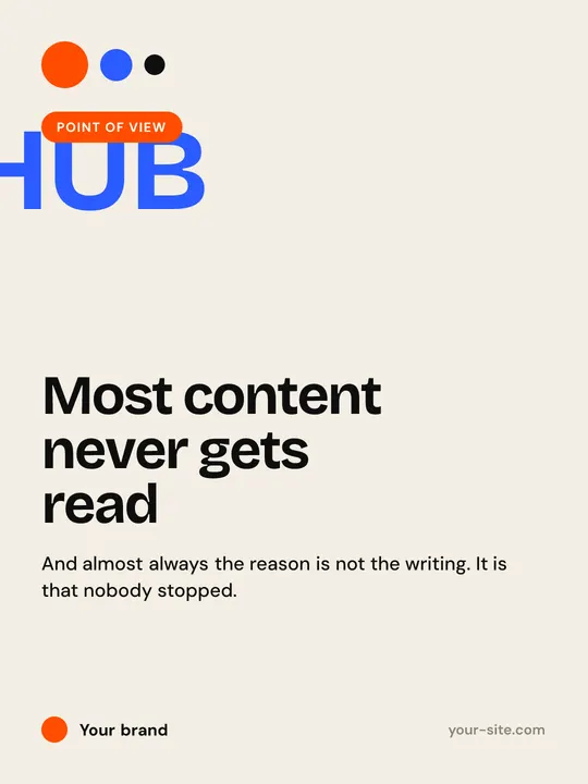
Open style →Stamps, hub circles and primary colour blocks. Type never sits on a photo — the photo becomes a circle.
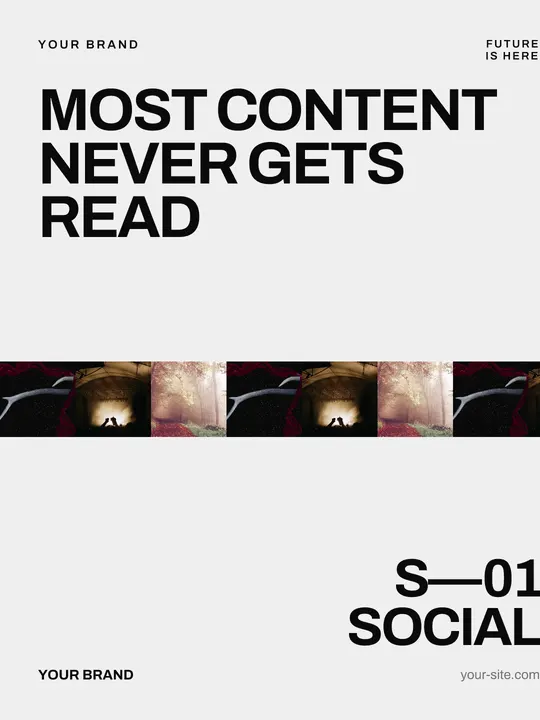
Open style →Two giant titles with a strip of square photos between them. The strip is the only ornament.
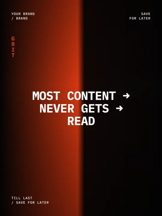
Open style →Grit and glow: white mono type dead-centre, meta in the corners, an orange burn on black.
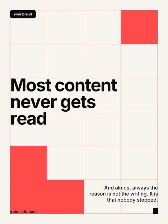
Open style →A visible Swiss grid: coral rules, solid filled cells, black type locked to the modules.
Open style →A shuffled photo deck in the centre, asymmetric titles, monospace meta in every corner.
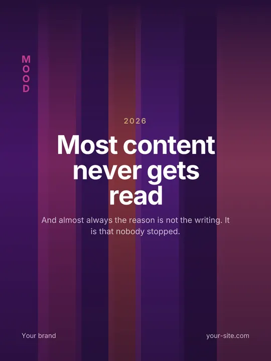
Open style →Vertical streak atmosphere, centred title, almost no ornament. Just light and type.
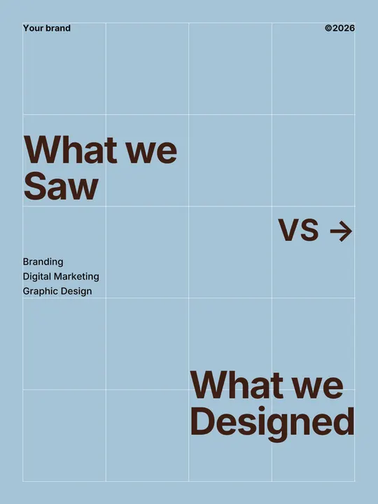
Open style →White grid on dusty blue, chocolate type, a SAW vs DESIGNED dialogue across the canvas.
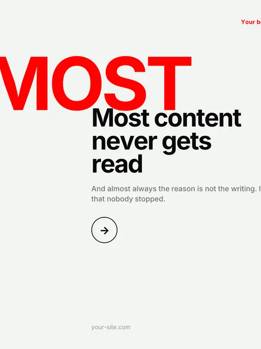
Open style →Massive red title bleeding off the edge. Black right column, circled arrow, tiny brand up top.
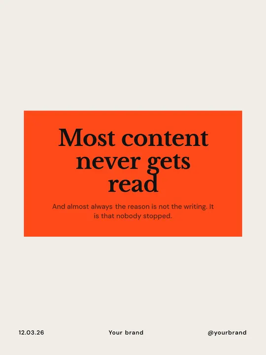
Open style →Letterpress paper and an orange stamp block: black serif ink inside, small sans meta in the footer.
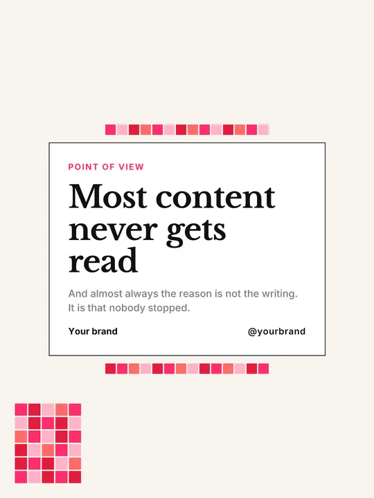
Open style →Coloured pixel clusters on cream: photo windows, serif quotes, a small handle in the corner.
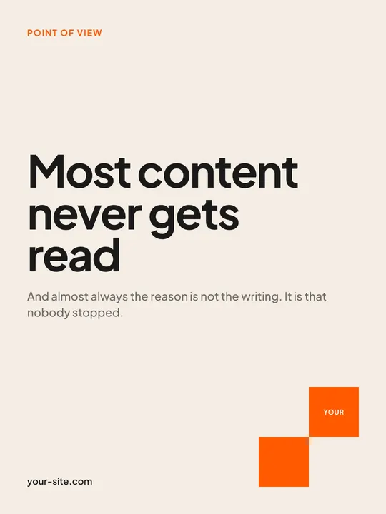
Open style →Orange corporate on cream. Checkers, brand bars, bold sans — equity-house energy.
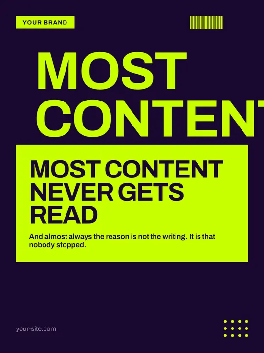
Open style →Lime on violet, a fake barcode, a word stacked down the edge. Rave-flyer energy.
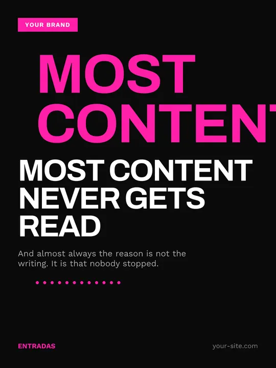
Open style →Hot magenta, black bars, sharp tags. Event-poster energy, no middle ground.
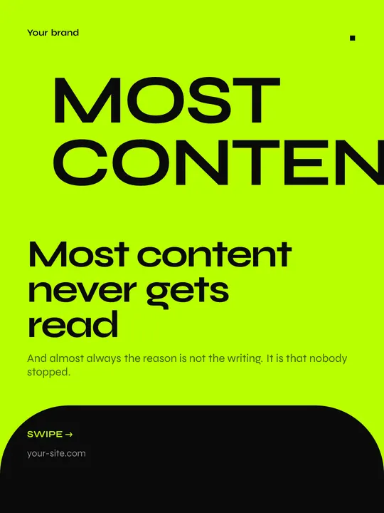
Open style →Neon green and black. Big shapes, a checklist crushed by a ✓, concentric voids.
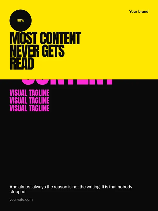
Open style →Pink, yellow, black. Slogans repeated as texture, split colour blocks, street energy.
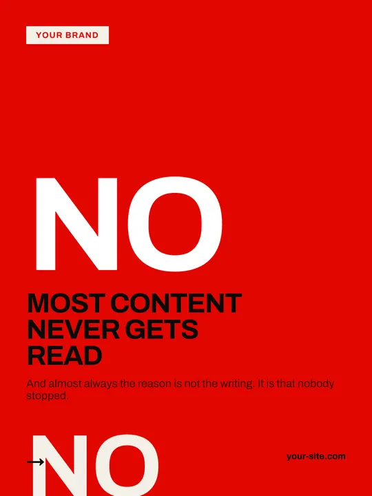
Open style →Campaign red, a giant NO, lists crossed by an X. A street manifesto, not a soft template.
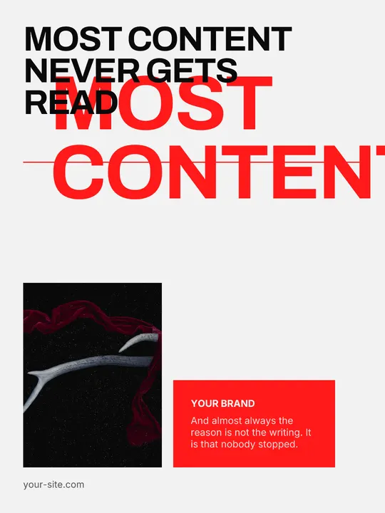
Open style →A red rectangle dropped on the photo, broken type, experimental-studio asymmetry.
Open style →Colour, fonts and logo come from your site. The style decides where the headline sits, how big it gets and how it behaves over a photograph — the three things that make a feed recognisable.