thebrandidentity
Pourquoi il est là
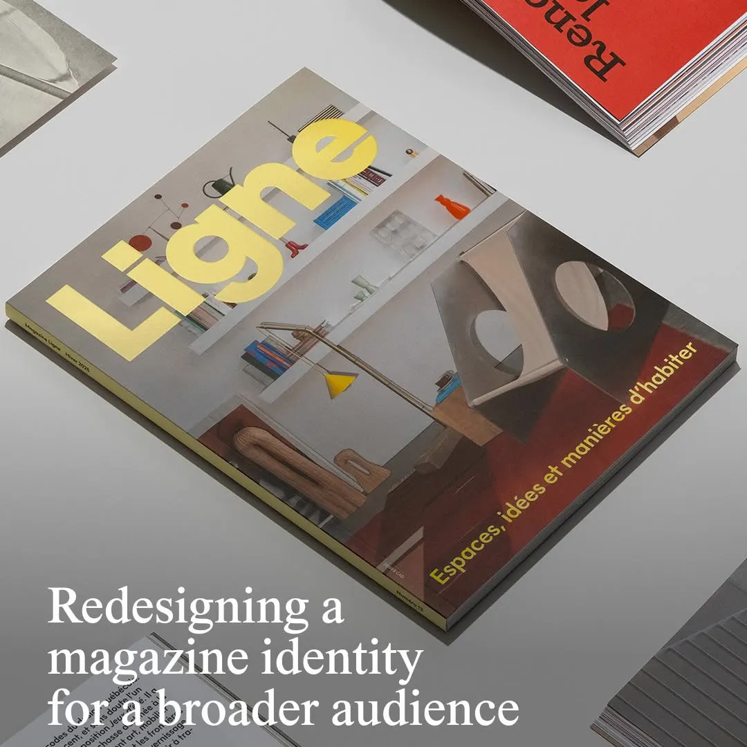
La typographie jaune vif du titre s'impose nettement sur une photographie d'intérieur architectural équilibrée.
La note
- Typographie
- 7
- Composition
- 7
- Couleur
- 6
- Exécution
- 7
- Originalité
- 6
72/100
Style
Détails
@principal.studio has redesigned independent design and architecture magazine @magazineligne to help it reach a wider readership. The Montreal-based strategy and design studio started with what the magazine is, on the premise that good design should be accessible to everyone…
Publié par thebrandidentity sur instagram. Les droits appartiennent à l’auteur — nous renvoyons vers l’original et n’hébergeons qu’un aperçu.
Vous êtes l’auteur et souhaitez le retrait de votre post ? Écrivez à hello@anomalia.so et il part le jour même.
Des posts bien faits
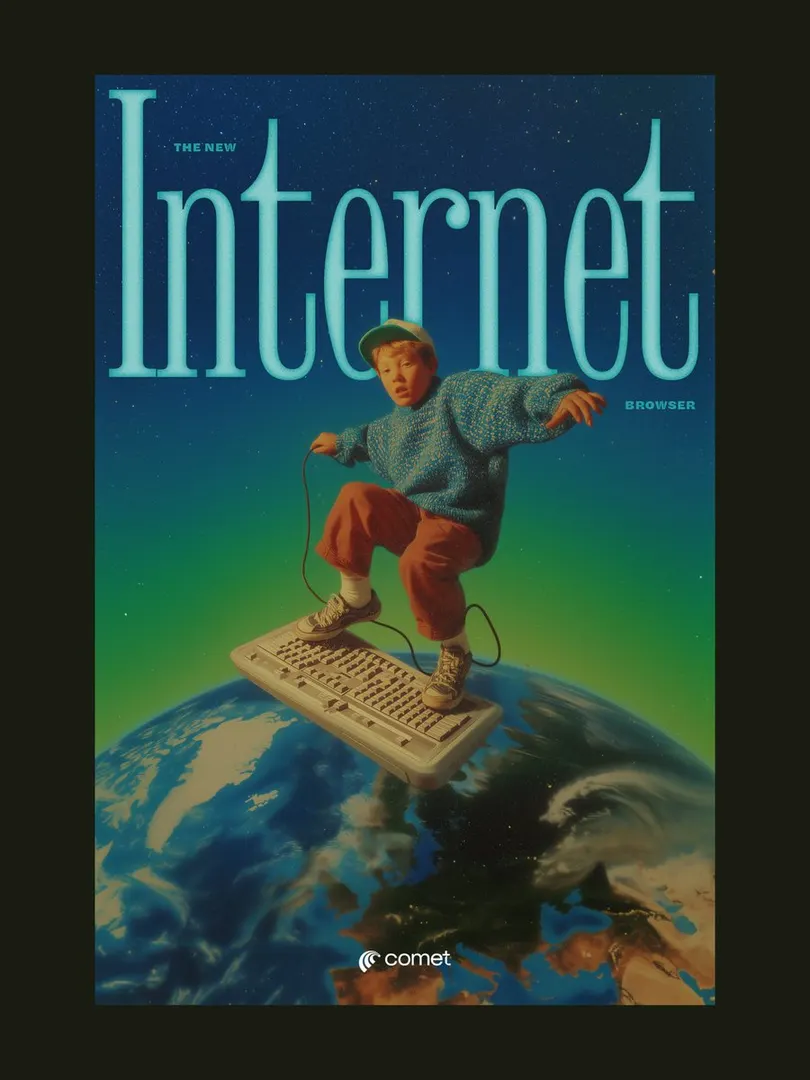 Le titre à empattements condensé encadre le sujet, créant de la profondeur dans une composition surréaliste rétro.
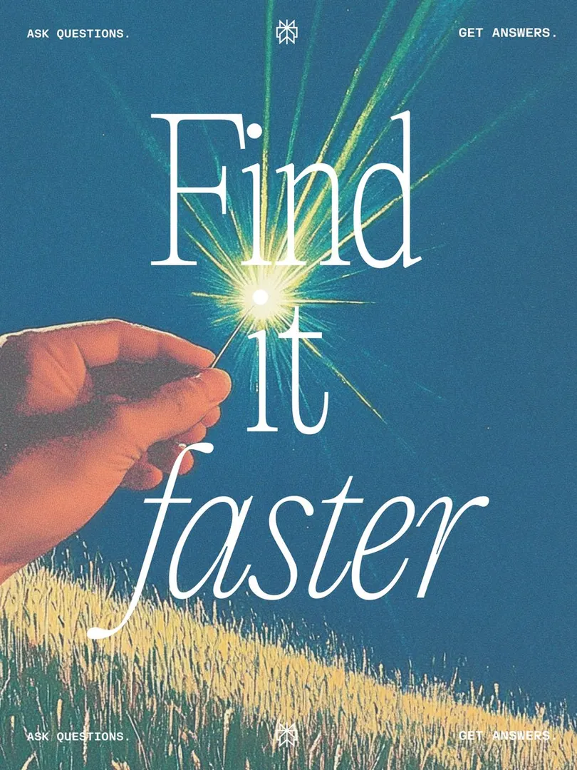 L'étincelle lumineuse s'aligne sur le point du « i », renforçant la métaphore de l'aiguille.
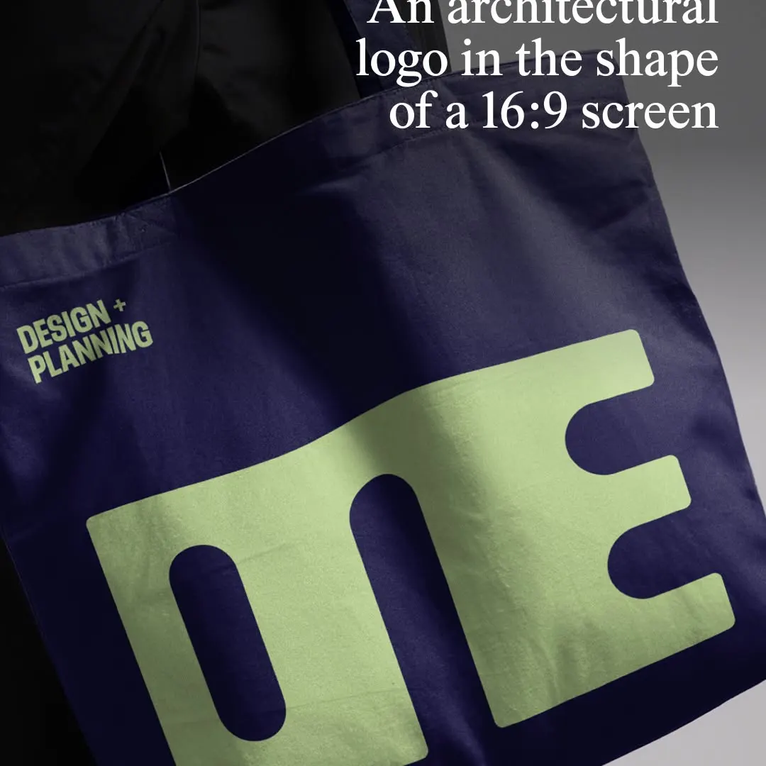 Le logotype monolithique compresse les glyphes au format 16:9 sur un mockup de tote bag textile.
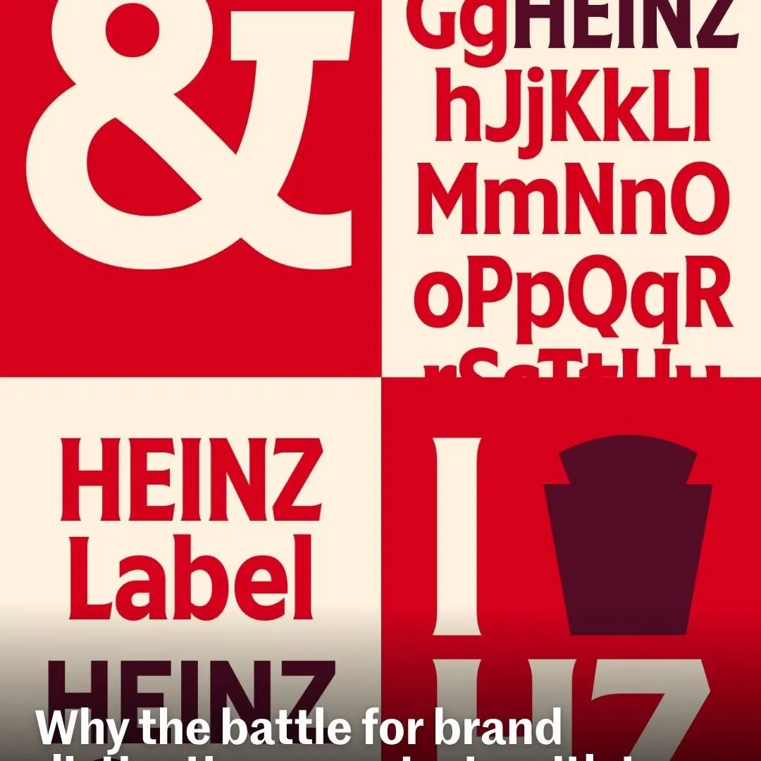 Des quadrants alternés créent un contraste rythmique mettant en valeur la typographie de marque.
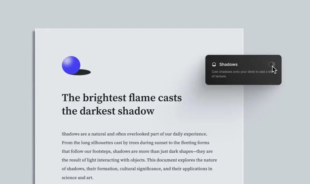 L'éclairage directionnel subtil et la typographie avec empattements confèrent au document numérique un aspect tactile.
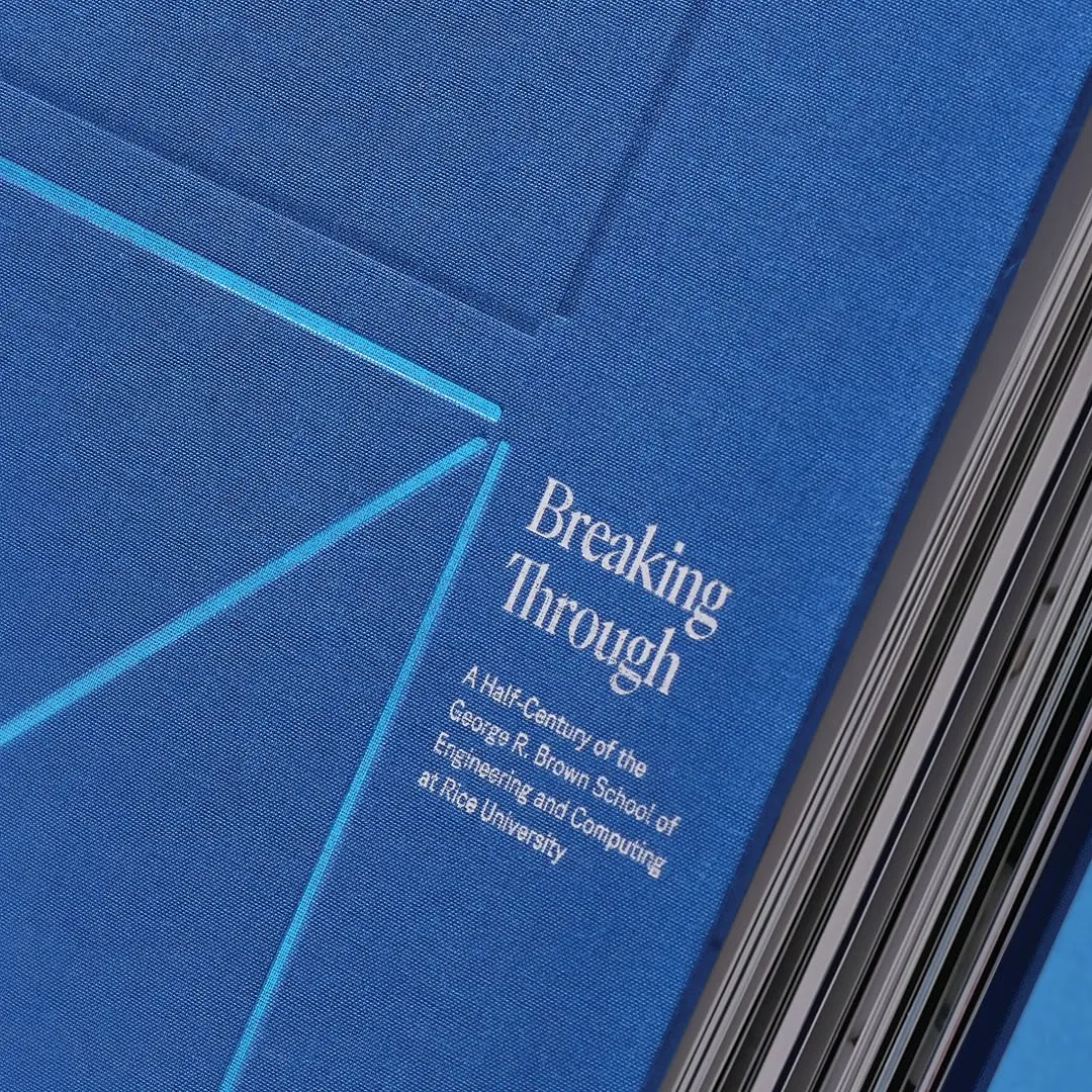 La typographie avec empattements contraste nettement avec la toile bleue et les fines lignes cyan géométriques.