thebrandidentity
Pourquoi il est là
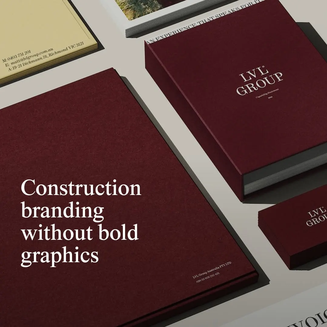
Rich burgundy paper paired with sharp serif typography brings an understated editorial elegance to construction branding.
La note
- Typographie
- 7
- Composition
- 7
- Couleur
- 7
- Exécution
- 7
- Originalité
- 6
72/100
Style
Détails
@studio_nascent has rebranded Melbourne builder @lvlgroupaus, refining its brand and aligning it with architecture and design. Drawing restraint from contemporary architecture, galleries and editorial design, the studio built the system on Dinamo’s ABC Synt and a rich royal…
Publié par thebrandidentity sur instagram. Les droits appartiennent à l’auteur — nous renvoyons vers l’original et n’hébergeons qu’un aperçu.
Vous êtes l’auteur et souhaitez le retrait de votre post ? Écrivez à hello@anomalia.so et il part le jour même.
Des posts bien faits
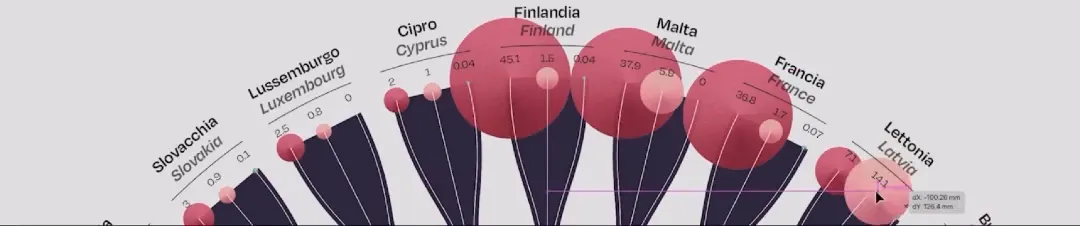 Delicate radial structure elegantly integrates organic shapes with precise multidimensional data points.
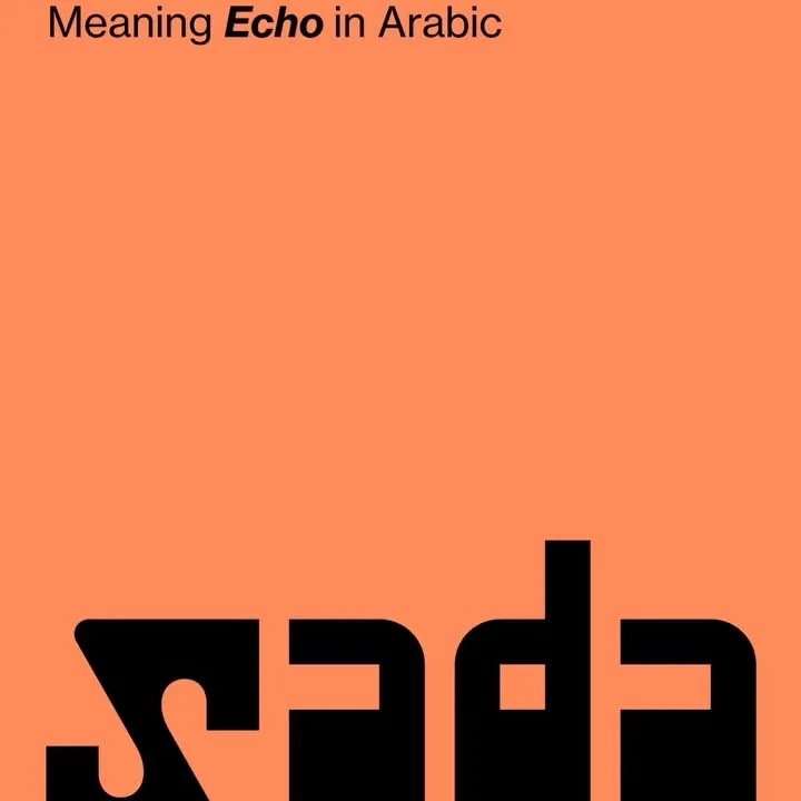 Heavy custom letterforms anchored to the lower edge balance generous negative space with stark contrast.
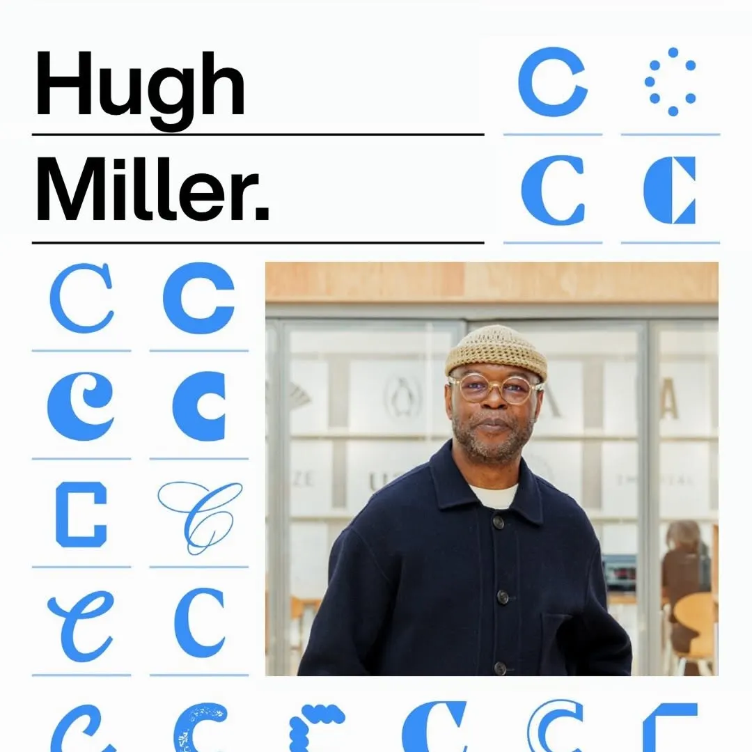 A disciplined modular grid organizes diverse typographic glyph variations alongside bold headline type and portraiture.
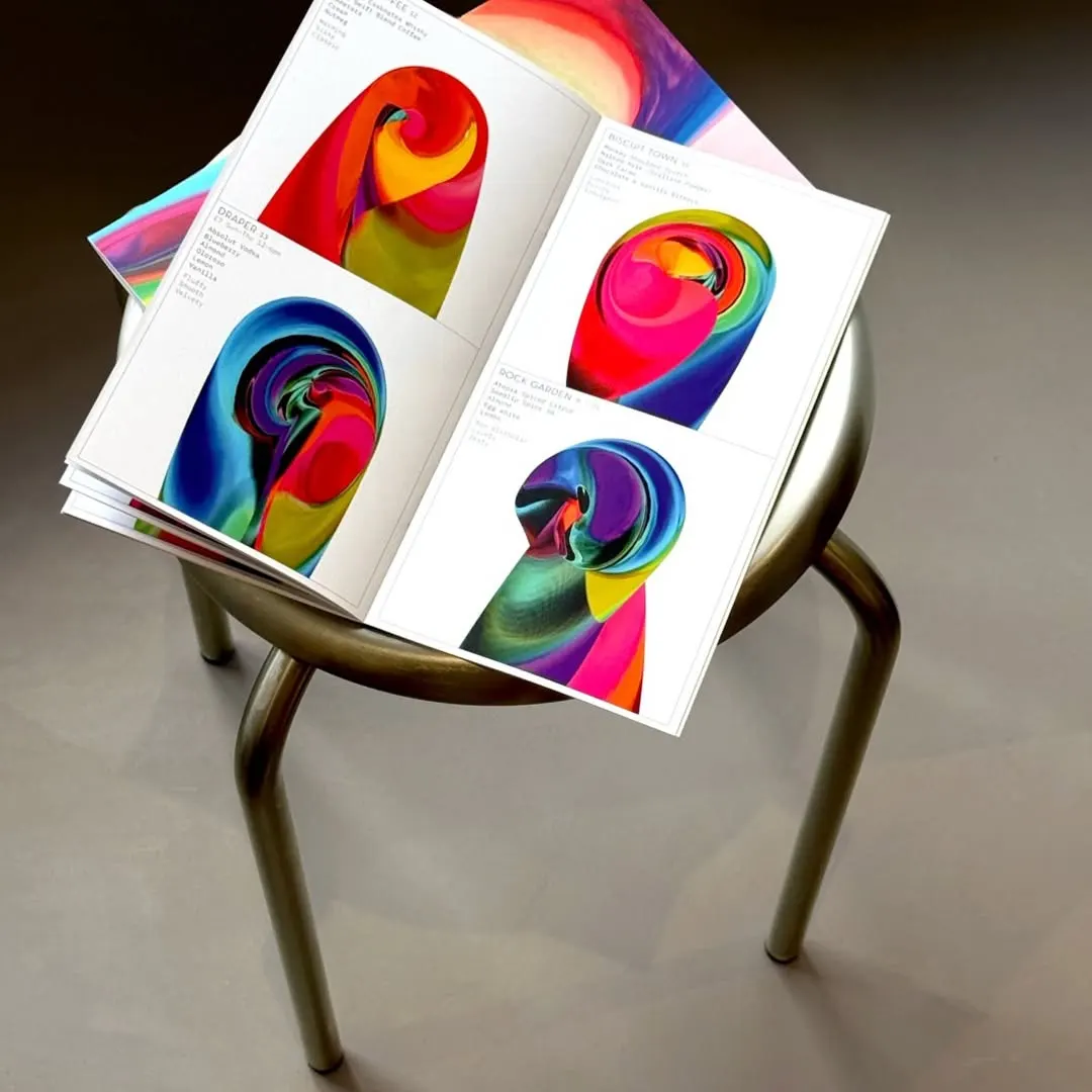 Vibrant generative swirls anchor the minimalist editorial layout alongside delicate, structured type.
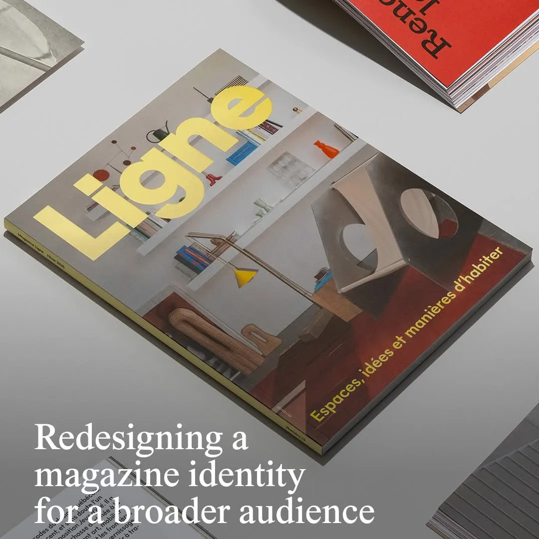 Bold yellow masthead typography sits firmly against a balanced architectural interior photograph.
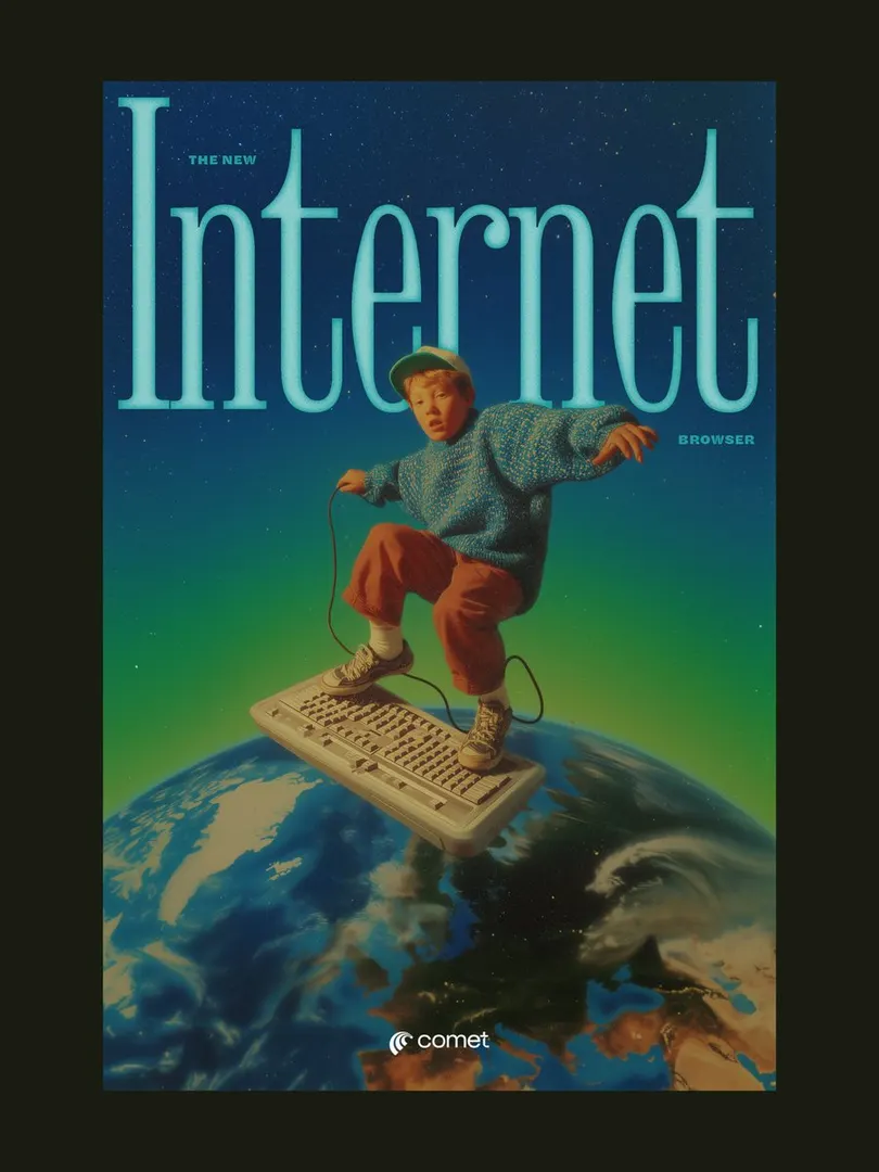 The condensed serif headline neatly frames the subject, creating layered depth in a retro surreal composition.