pentagramdesign
Perché è qui
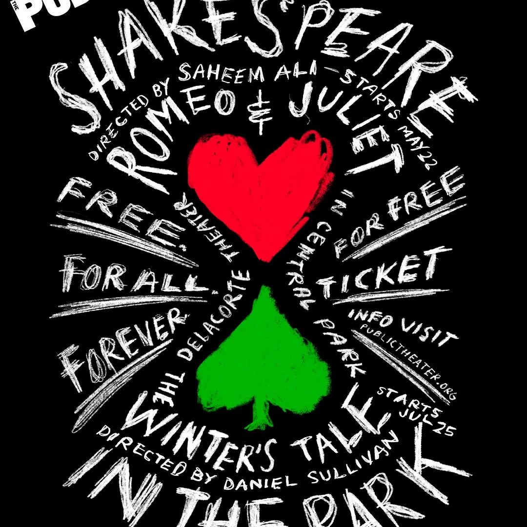
Il lettering a mano si irradia dinamicamente attorno ai semi centrali creando forte energia visiva.
Il voto
- Tipografia
- 7
- Composizione
- 7
- Colore
- 6
- Cura
- 7
- Originalità
- 7
76/100
Stile
Dettagli
Since 1994, Paula Scher has designed the promotional campaigns for Shakespeare in the Park, the free summer performances presented by @publictheaterny at the Delacorte Theater in Central Park. Each year, the Shakespeare graphics update the spirit and use of Knockout, the font of…
Pubblicato da pentagramdesign su instagram. I diritti sono dell’autore — noi linkiamo l’originale e ospitiamo solo un’anteprima.
Sei l’autore e vuoi che il tuo post sparisca? Scrivi a hello@anomalia.so e lo togliamo in giornata.
Post fatti bene
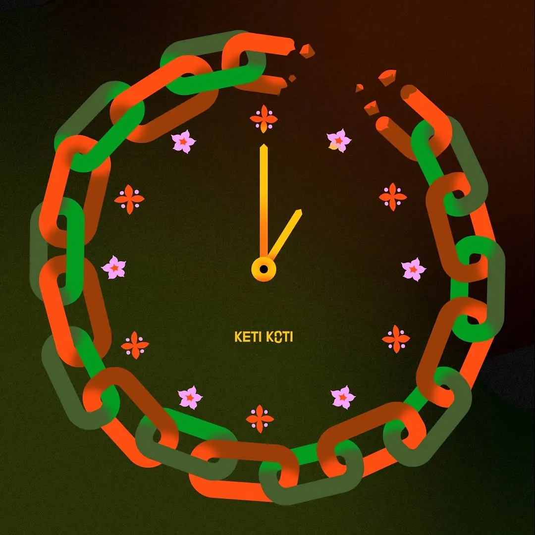 La catena spezzata funge abilmente da quadrante d'orologio, incorniciata da delicati indici floreali.
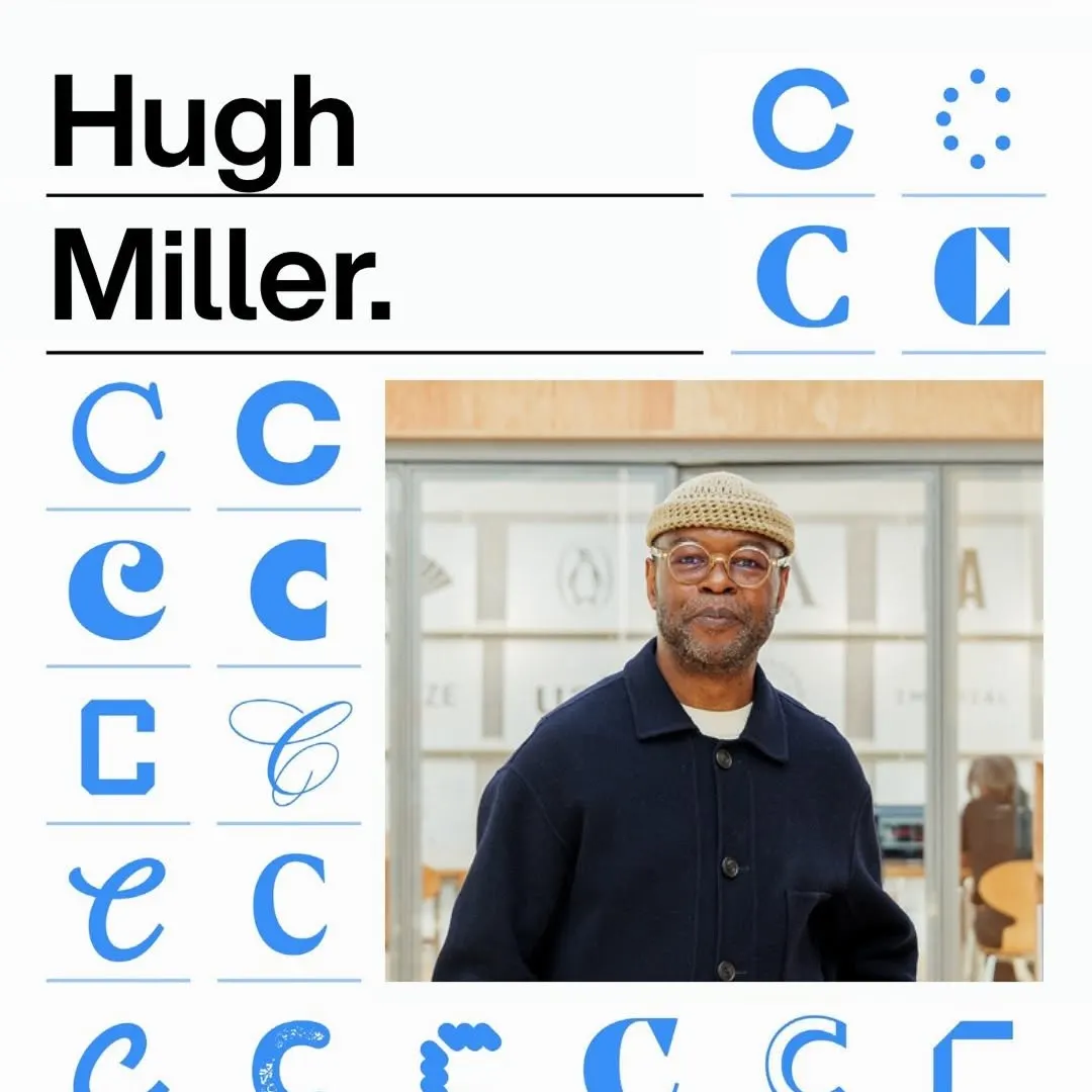 Una griglia modulare rigorosa organizza variazioni tipografiche del glifo accanto a titoli audaci e al ritratto.
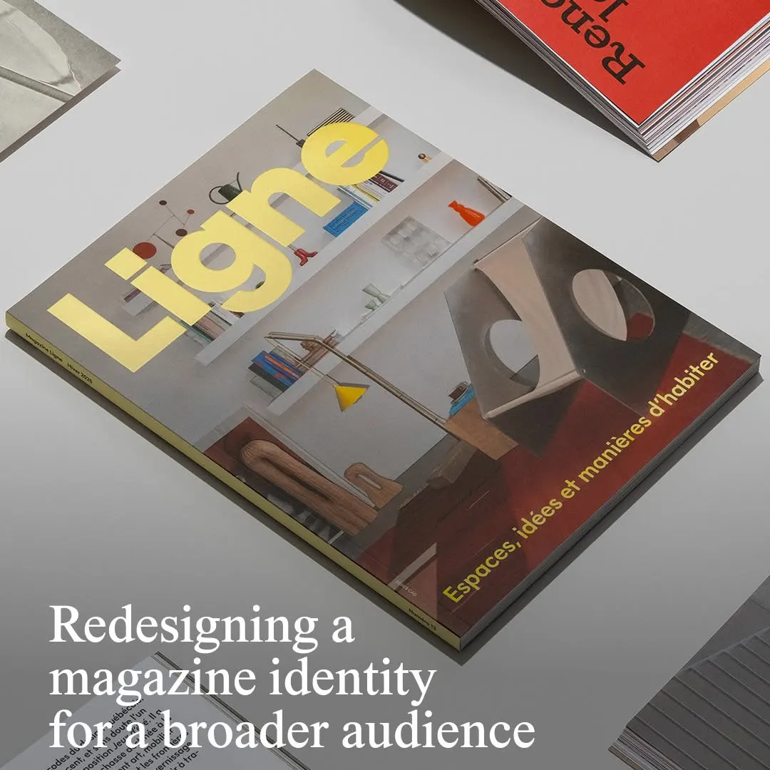 La tipografia gialla della testata risalta con decisione su una fotografia architettonica d'interni ben bilanciata.
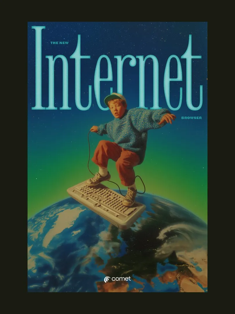 Il titolo con grazie compresso incornicia il soggetto, creando profondità in una composizione surrealista retrò.
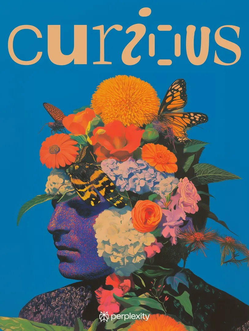 Il lettering giocoso bilancia il denso ritratto botanico contro un vivido sfondo compatto.
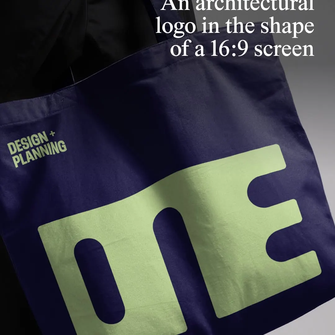 Il logotipo monolitico comprime i caratteri in una proporzione 16:9 sul mockup della borsa in tessuto.