thebrandidentity
Perché è qui
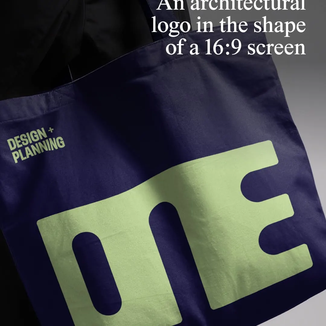
Il logotipo monolitico comprime i caratteri in una proporzione 16:9 sul mockup della borsa in tessuto.
Il voto
- Tipografia
- 7
- Composizione
- 7
- Colore
- 7
- Cura
- 7
- Originalità
- 6
70/100
Stile
Dettagli
@5x5.design has evolved the identity for @one_arch_urb, an architecture and urbanism practice that designs resilient cities for the long term. The London-based agency built the new mark directly from the letterforms of Typotheque’s Zed Display, merging them into a…
Pubblicato da thebrandidentity su instagram. I diritti sono dell’autore — noi linkiamo l’originale e ospitiamo solo un’anteprima.
Sei l’autore e vuoi che il tuo post sparisca? Scrivi a hello@anomalia.so e lo togliamo in giornata.
Post fatti bene
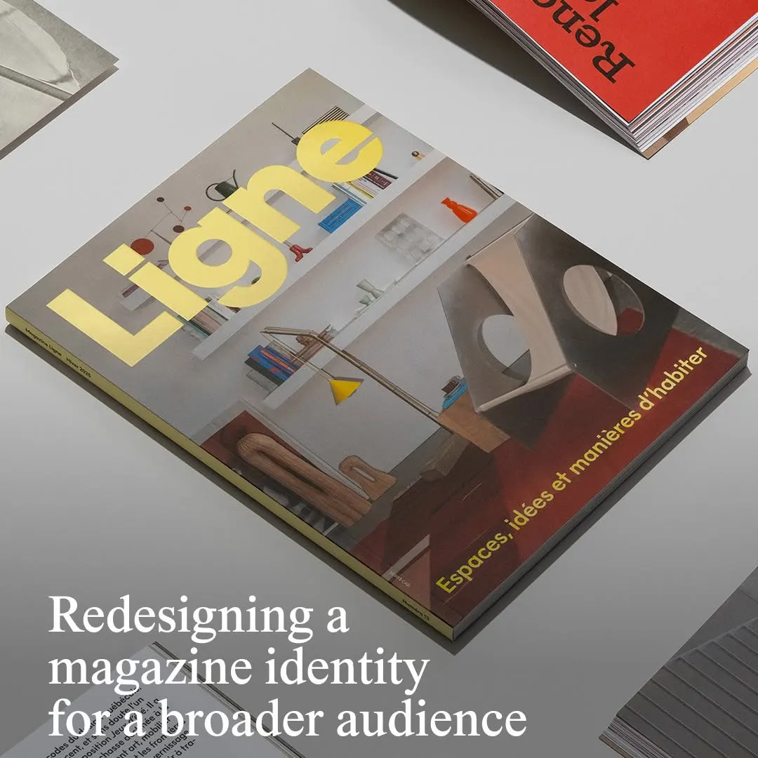 La tipografia gialla della testata risalta con decisione su una fotografia architettonica d'interni ben bilanciata.
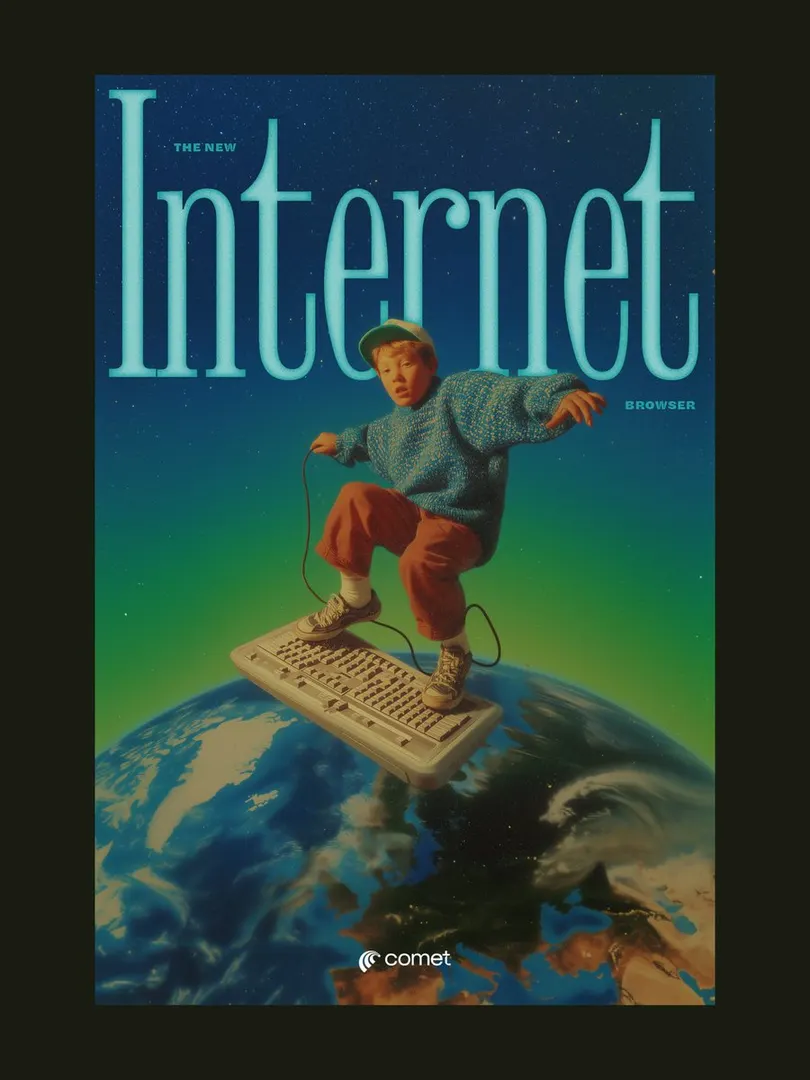 Il titolo con grazie compresso incornicia il soggetto, creando profondità in una composizione surrealista retrò.
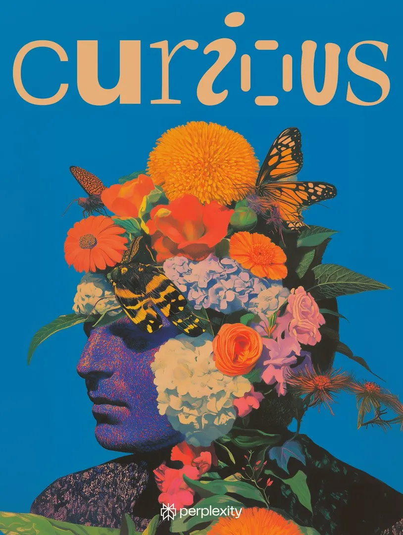 Il lettering giocoso bilancia il denso ritratto botanico contro un vivido sfondo compatto.
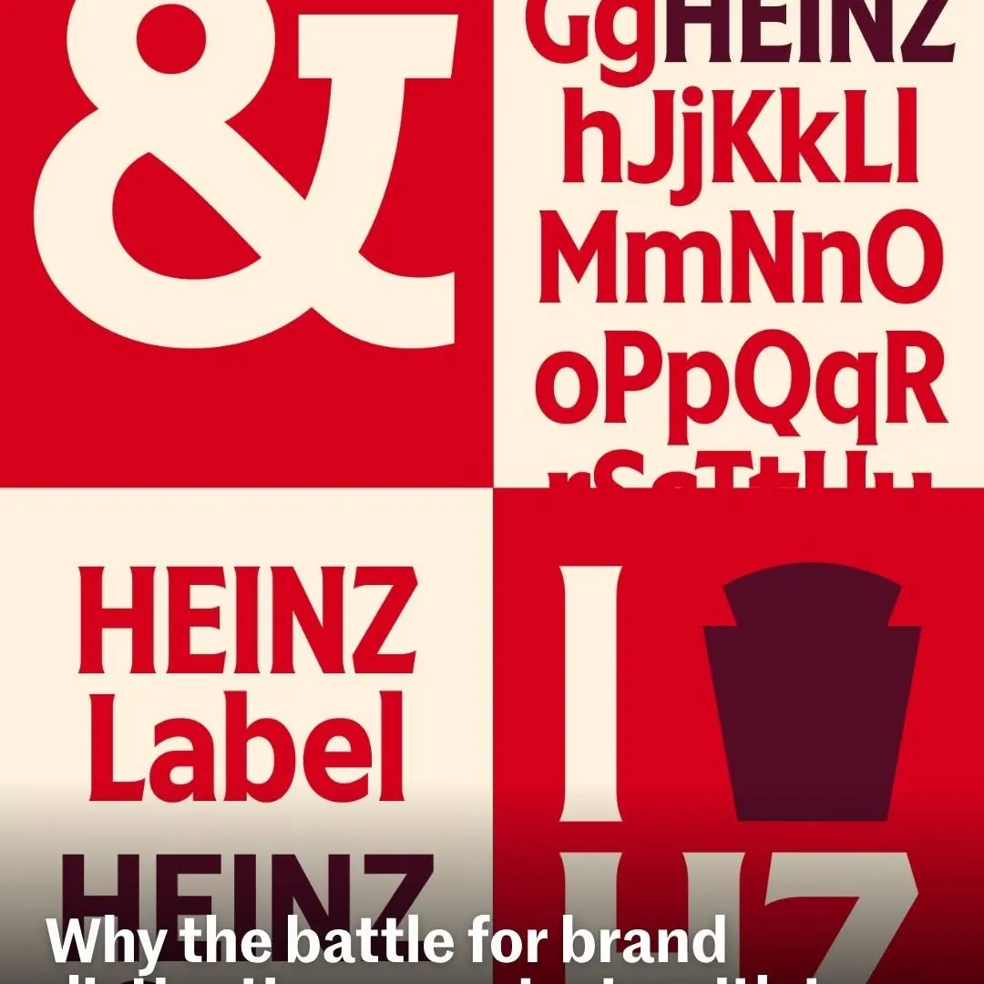 Quadranti alternati creano un contrasto ritmico per valorizzare la tipografia personalizzata del brand.
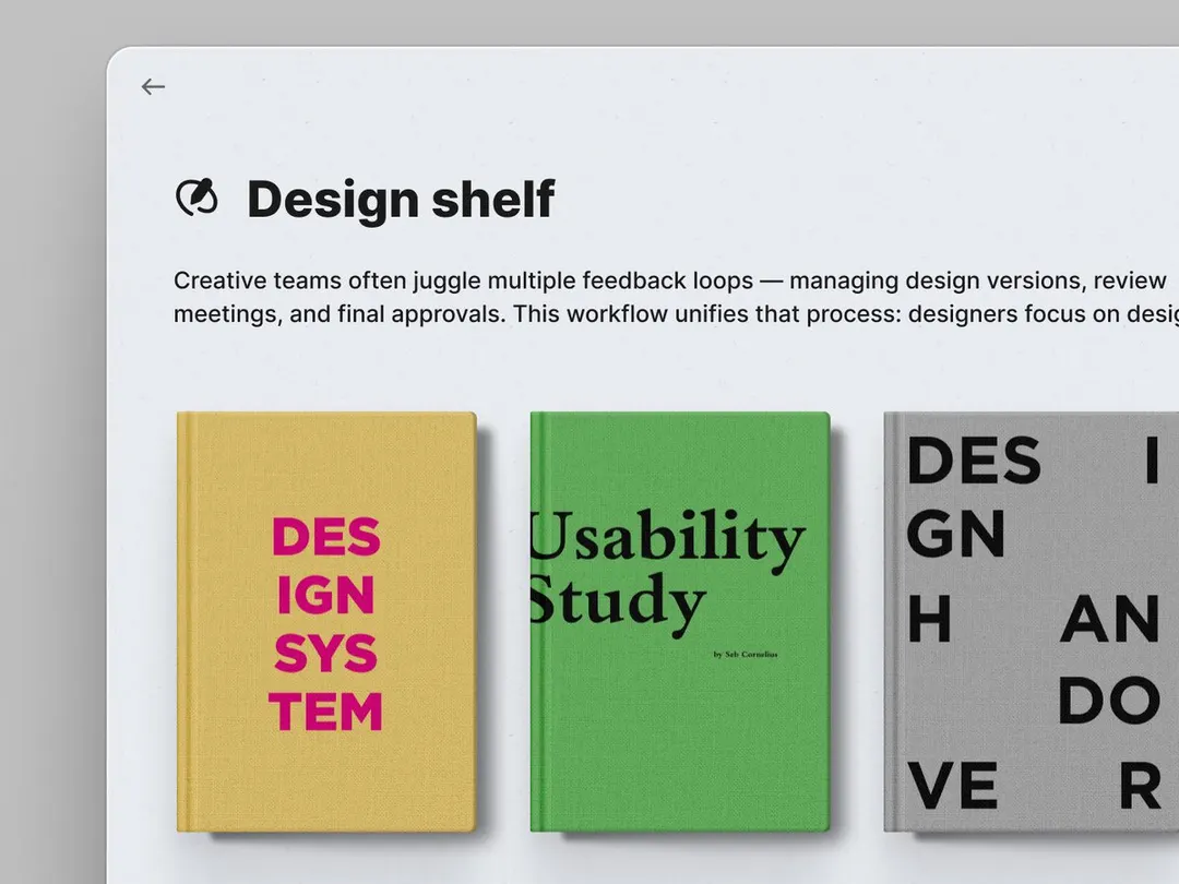 Le copertine materiche dei libri radicano la tipografia minimale dell'interfaccia con colore e peso tangibili.
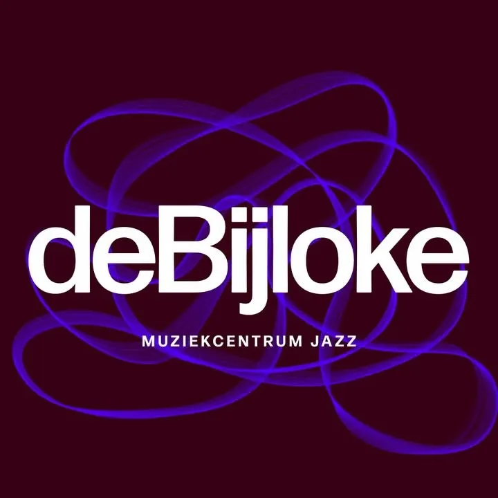 Linee fluide a oscilloscopio si intrecciano dietro la tipografia bianca per evocare l'improvvisazione musicale.