thebrandidentity
Por qué está aquí
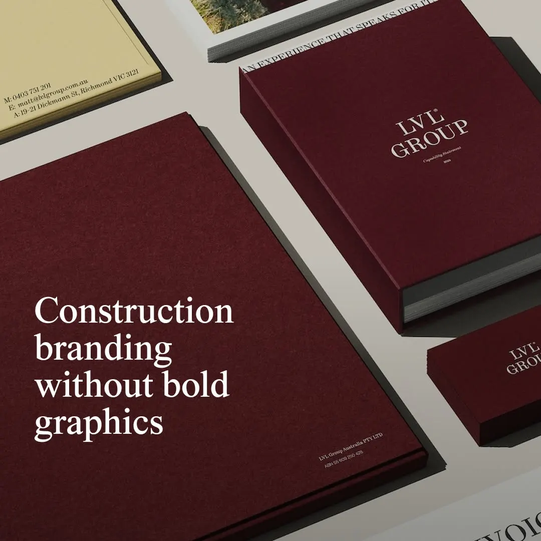
El papel burdeos con tipografía con remates aporta a la marca un refinamiento editorial sobrio.
La nota
- Tipografía
- 7
- Composición
- 7
- Color
- 7
- Ejecución
- 7
- Originalidad
- 6
72/100
Estilo
Detalles
@studio_nascent has rebranded Melbourne builder @lvlgroupaus, refining its brand and aligning it with architecture and design. Drawing restraint from contemporary architecture, galleries and editorial design, the studio built the system on Dinamo’s ABC Synt and a rich royal…
Publicado por thebrandidentity en instagram. Los derechos son de su autor — enlazamos al original y solo alojamos una vista previa.
¿Eres el autor y quieres que retiremos tu post? Escribe a hello@anomalia.so y lo quitamos el mismo día.
Posts bien hechos
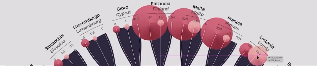 La delicada estructura radial integra elegantemente formas orgánicas con puntos de datos multidimensionales precisos.
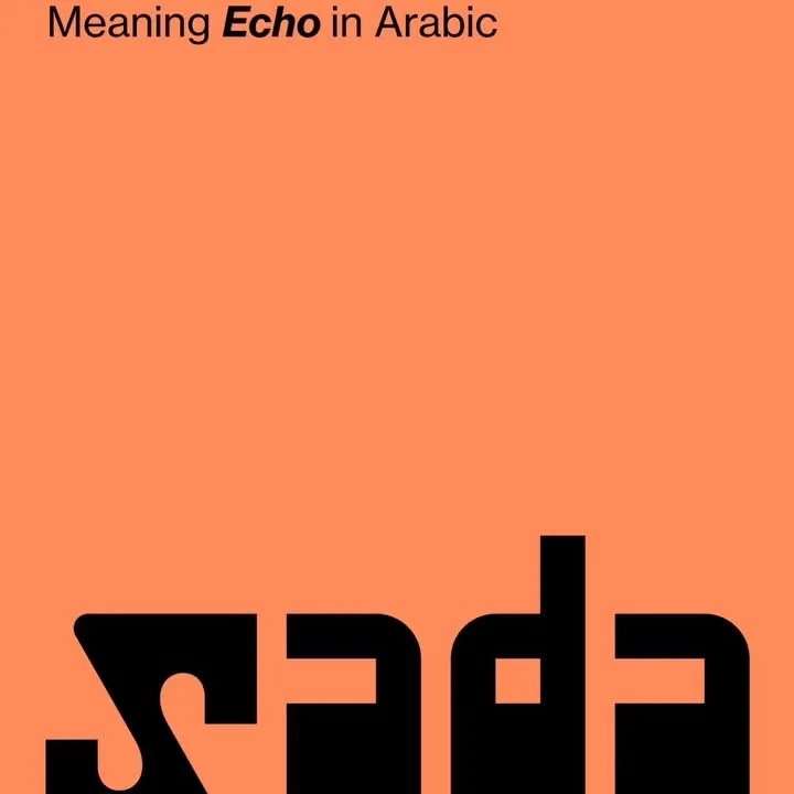 Tipografía pesada y personalizada anclada al borde inferior equilibra el espacio negativo con gran contraste.
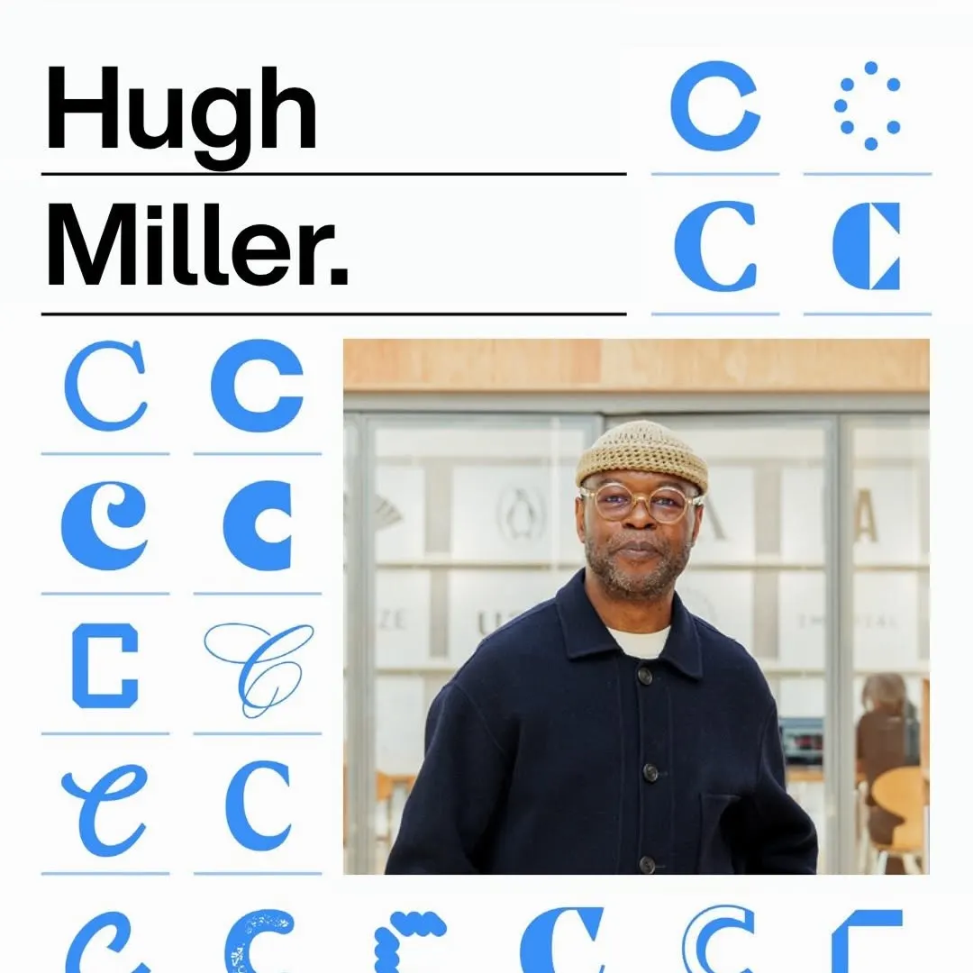 Una cuadrícula modular rigurosa organiza variaciones tipográficas junto a titulares contundentes y el retrato.
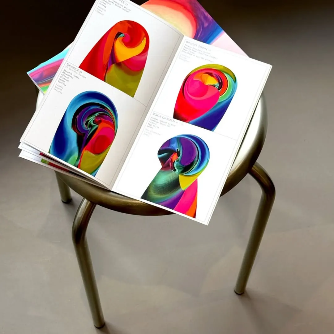 Vibrantes espirales generativas anclan la maquetación editorial minimalista junto a una tipografía delicada.
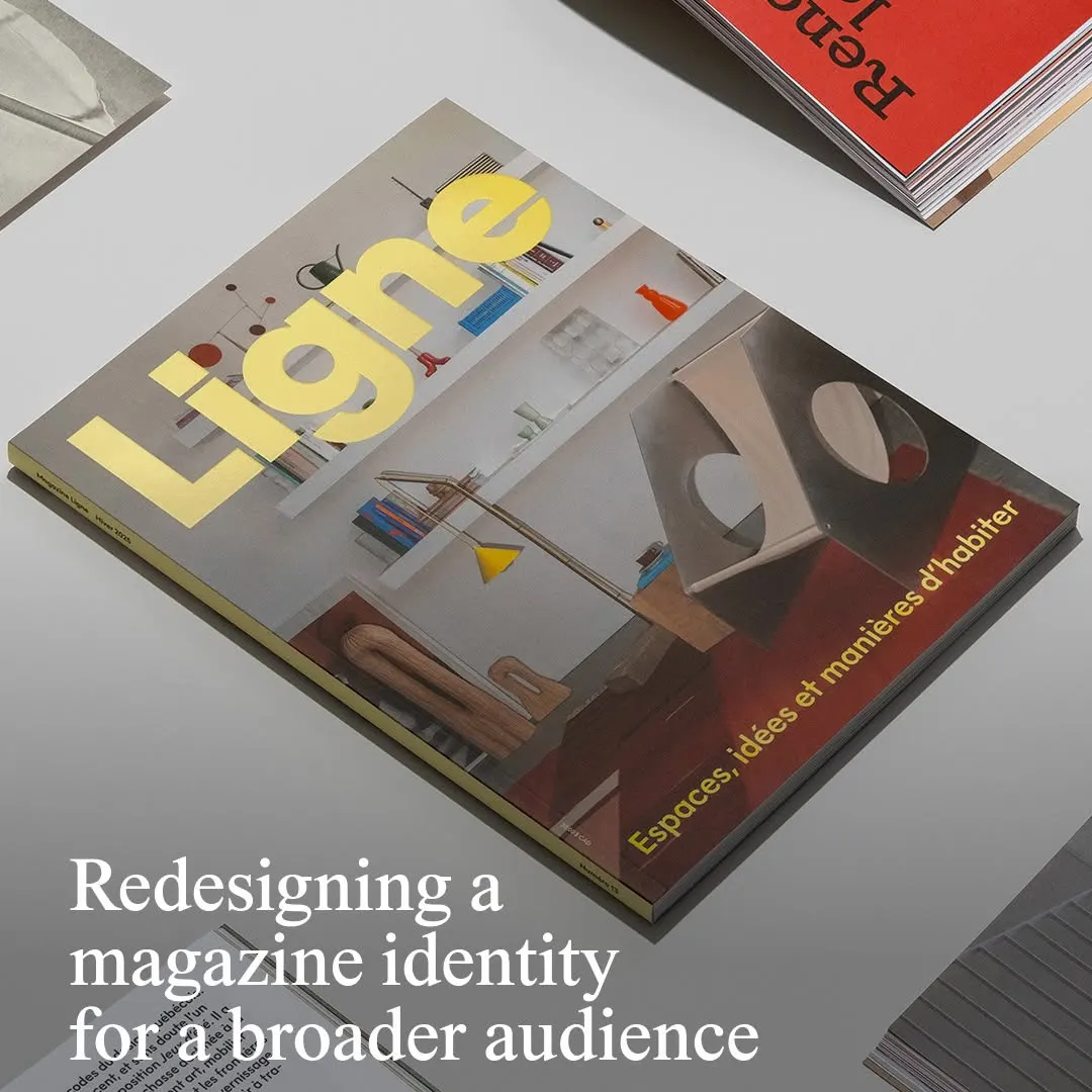 La tipografía amarilla de la cabecera destaca con firmeza sobre una fotografía arquitectónica equilibrada.
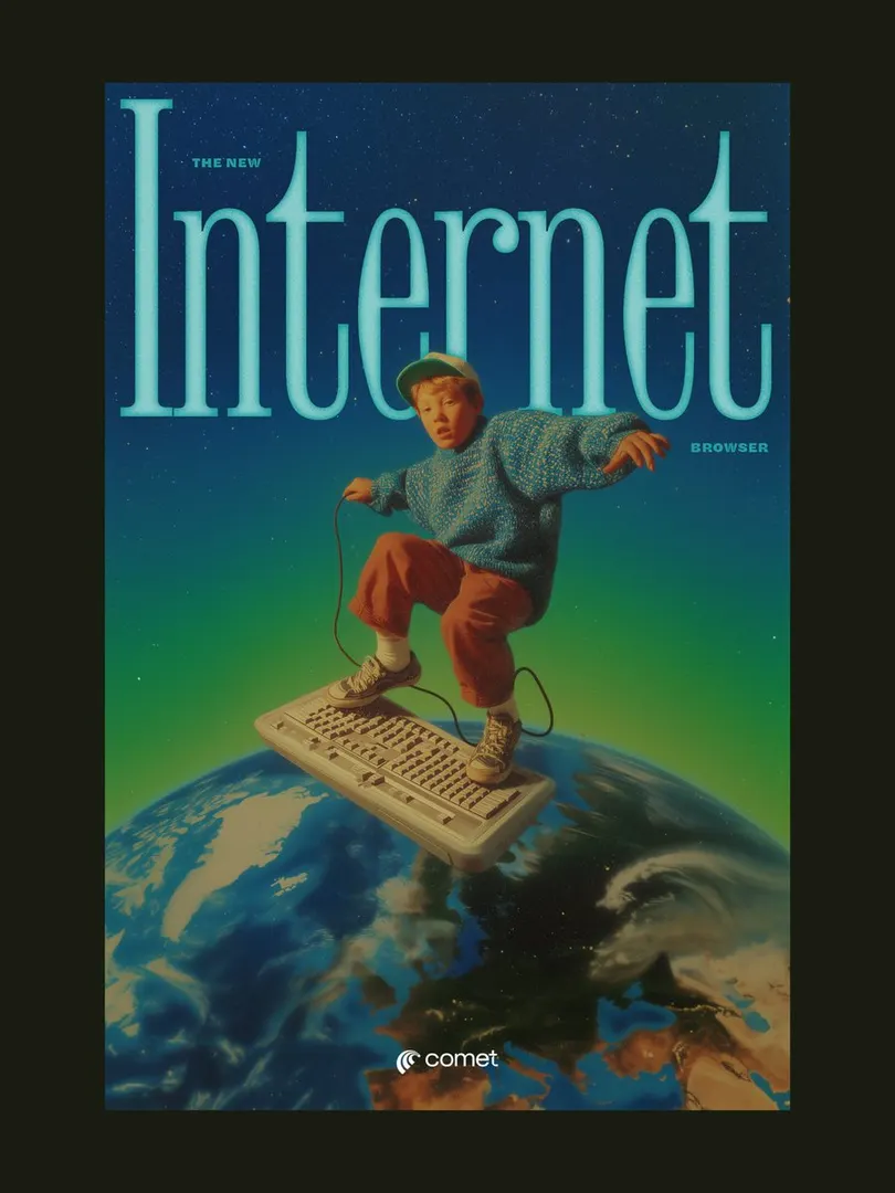 El titular con serifa comprimida enmarca al sujeto, creando profundidad en una composición surrealista retro.