thebrandidentity
Por qué está aquí
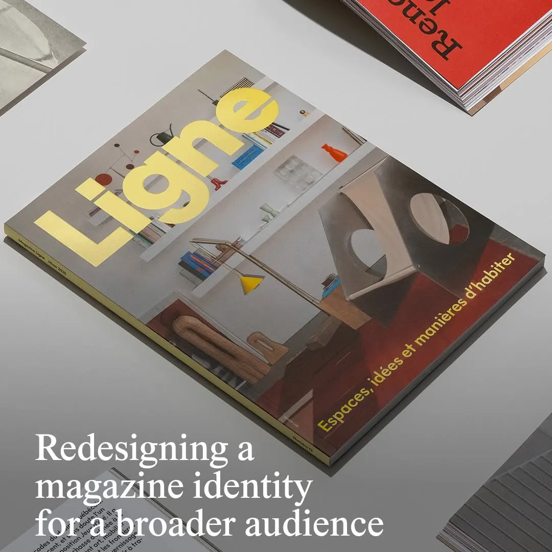
La tipografía amarilla de la cabecera destaca con firmeza sobre una fotografía arquitectónica equilibrada.
La nota
- Tipografía
- 7
- Composición
- 7
- Color
- 6
- Ejecución
- 7
- Originalidad
- 6
72/100
Estilo
Detalles
@principal.studio has redesigned independent design and architecture magazine @magazineligne to help it reach a wider readership. The Montreal-based strategy and design studio started with what the magazine is, on the premise that good design should be accessible to everyone…
Publicado por thebrandidentity en instagram. Los derechos son de su autor — enlazamos al original y solo alojamos una vista previa.
¿Eres el autor y quieres que retiremos tu post? Escribe a hello@anomalia.so y lo quitamos el mismo día.
Posts bien hechos
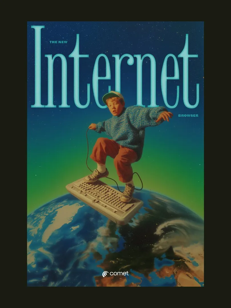 El titular con serifa comprimida enmarca al sujeto, creando profundidad en una composición surrealista retro.
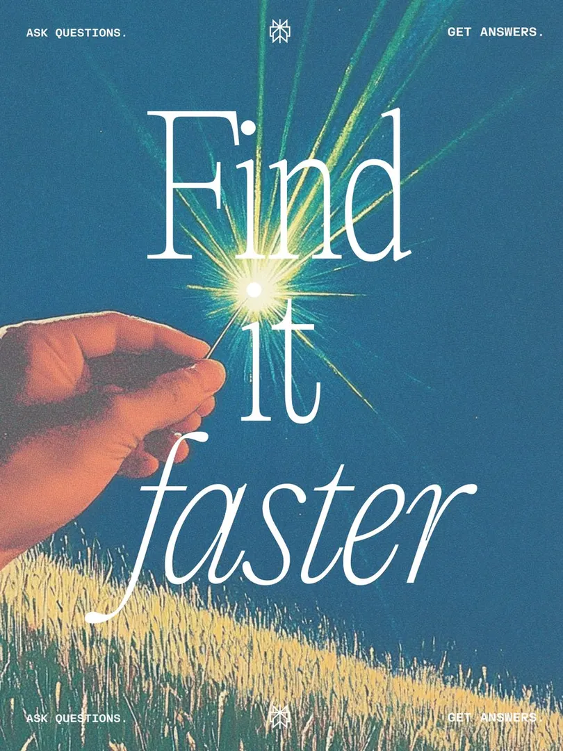 El destello luminoso se alinea con el punto de la 'i', reforzando la metáfora de la aguja.
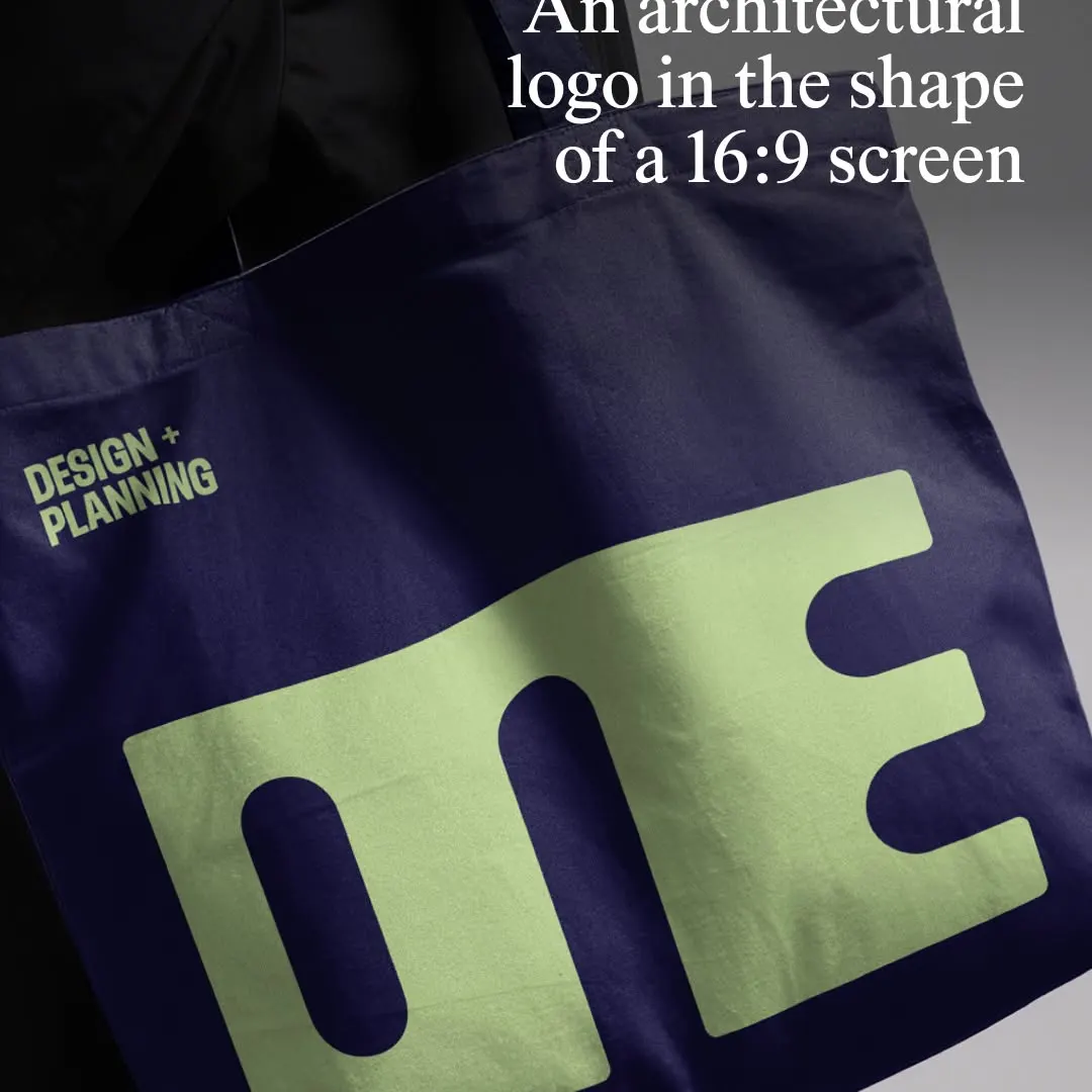 El logotipo monolítico comprime los caracteres en una proporción 16:9 sobre el mockup de la bolsa textil.
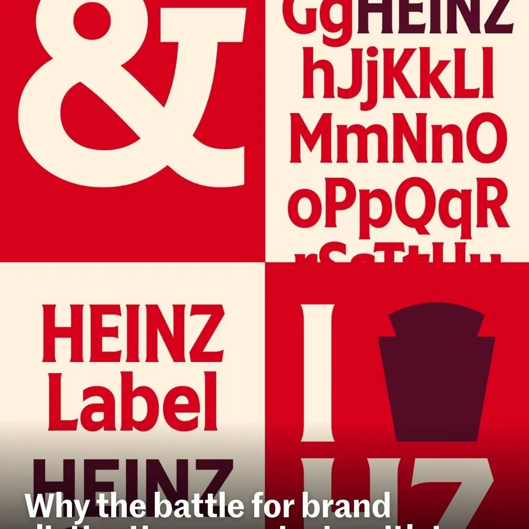 Cuadrantes alternados generan un contraste rítmico para exhibir la tipografía personalizada de la marca.
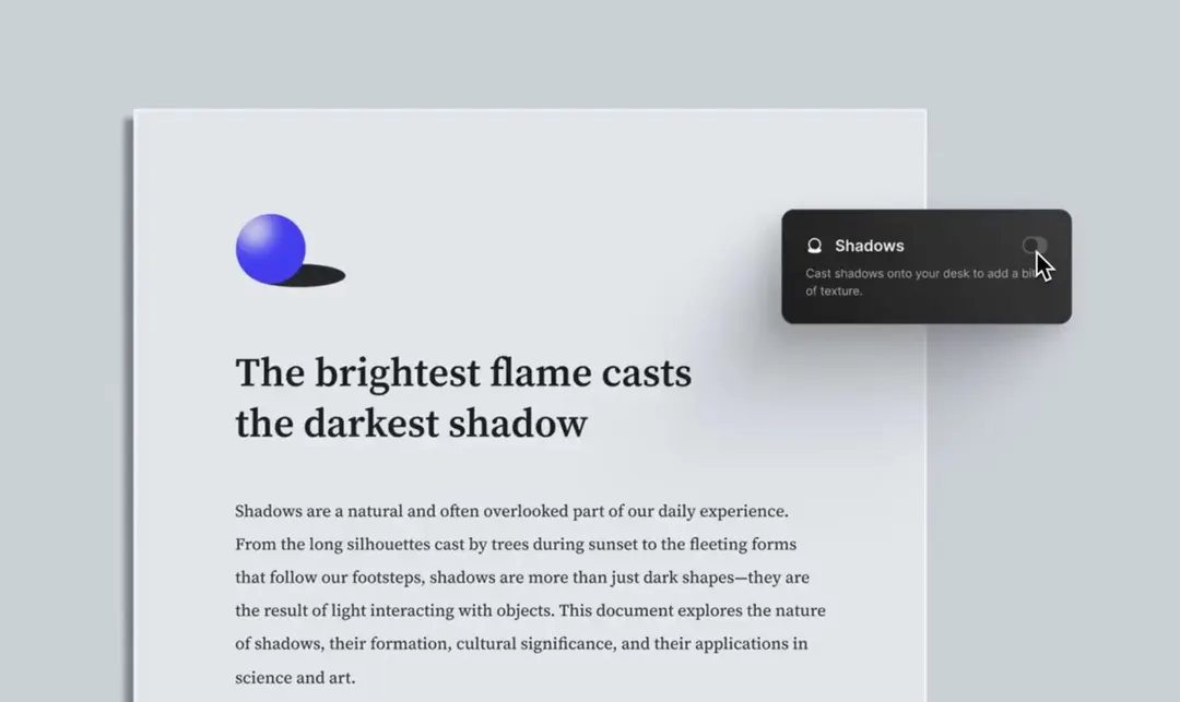 La iluminación direccional sutil y la tipografía con serifa otorgan al documento digital una sensación táctil.
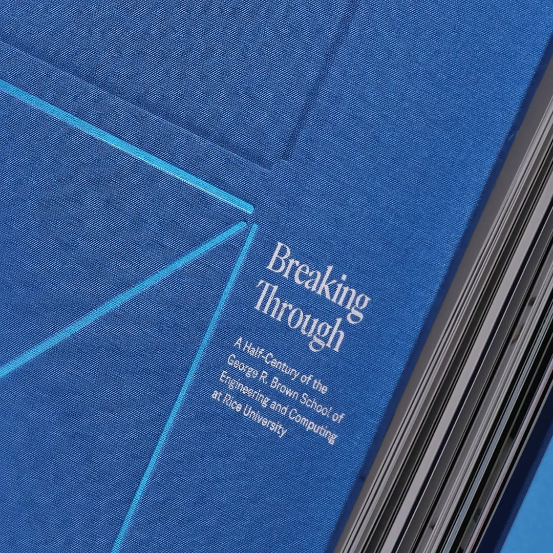 La tipografía serif nítida contrasta limpiamente con la tela azul y sutiles líneas geométricas cian.