thebrandidentity
Por qué está aquí
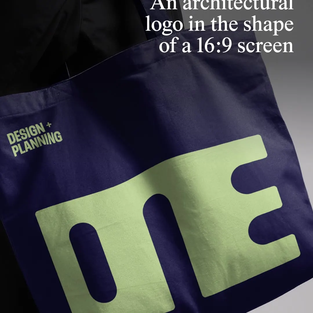
El logotipo monolítico comprime los caracteres en una proporción 16:9 sobre el mockup de la bolsa textil.
La nota
- Tipografía
- 7
- Composición
- 7
- Color
- 7
- Ejecución
- 7
- Originalidad
- 6
70/100
Estilo
Detalles
@5x5.design has evolved the identity for @one_arch_urb, an architecture and urbanism practice that designs resilient cities for the long term. The London-based agency built the new mark directly from the letterforms of Typotheque’s Zed Display, merging them into a…
Publicado por thebrandidentity en instagram. Los derechos son de su autor — enlazamos al original y solo alojamos una vista previa.
¿Eres el autor y quieres que retiremos tu post? Escribe a hello@anomalia.so y lo quitamos el mismo día.
Posts bien hechos
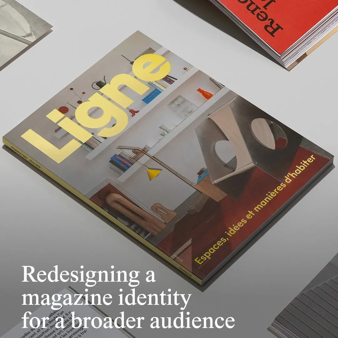 La tipografía amarilla de la cabecera destaca con firmeza sobre una fotografía arquitectónica equilibrada.
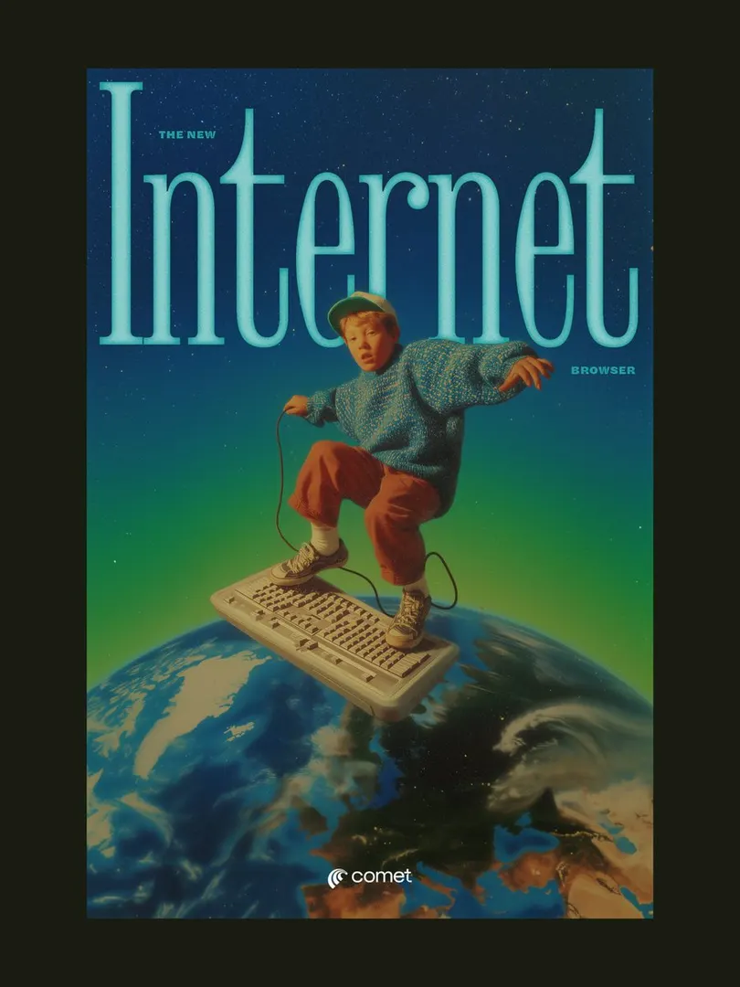 El titular con serifa comprimida enmarca al sujeto, creando profundidad en una composición surrealista retro.
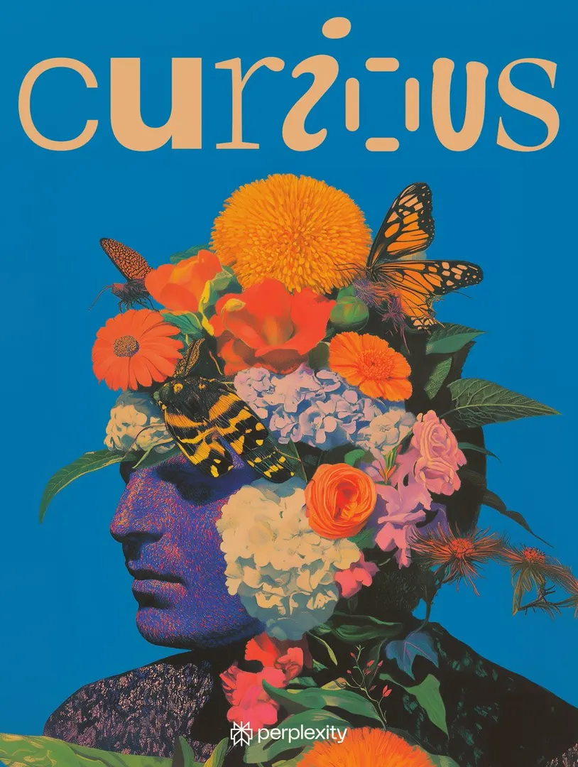 Las letras personalizadas equilibran el denso retrato botánico sobre un fondo sólido y vívido.
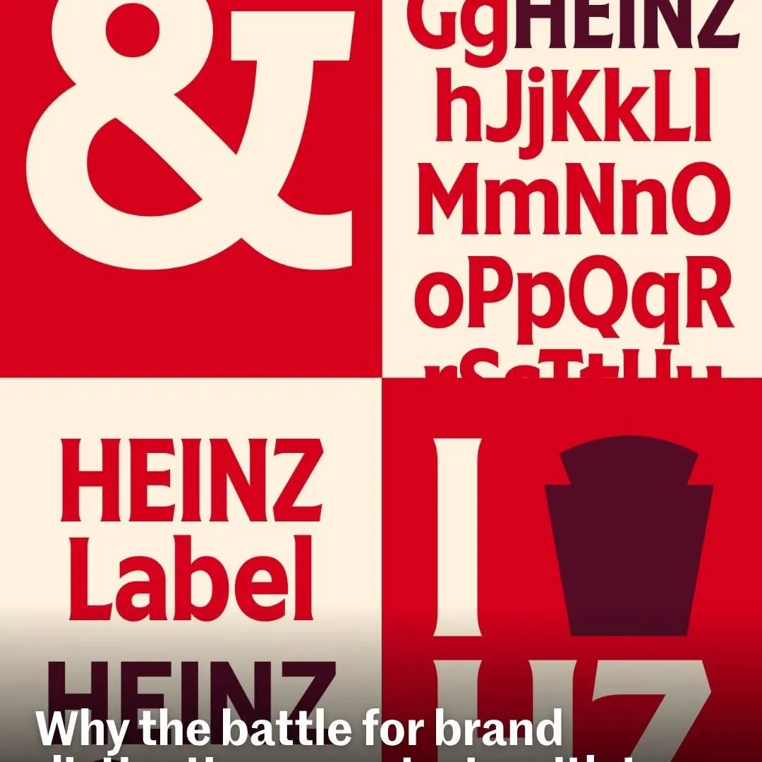 Cuadrantes alternados generan un contraste rítmico para exhibir la tipografía personalizada de la marca.
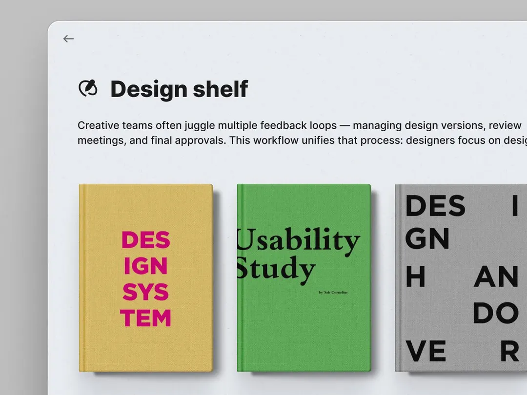 Las portadas de libros con textura anclan la tipografía minimalista de la interfaz con color y peso.
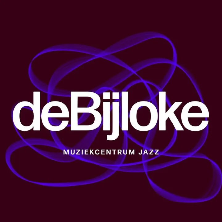 Líneas fluidas de osciloscopio se entrelazan tras la tipografía blanca para evocar la improvisación musical.